The Feeling of Color
How color shapes mood, stress, and emotional comfort — and why your nervous system notices before you do.
Color does more than decorate a space; it shapes how that space feels. This article explores the role of color psychology in interior design and explains how choosing paint through the lens of emotional comfort can transform both your home and your decision-making process.
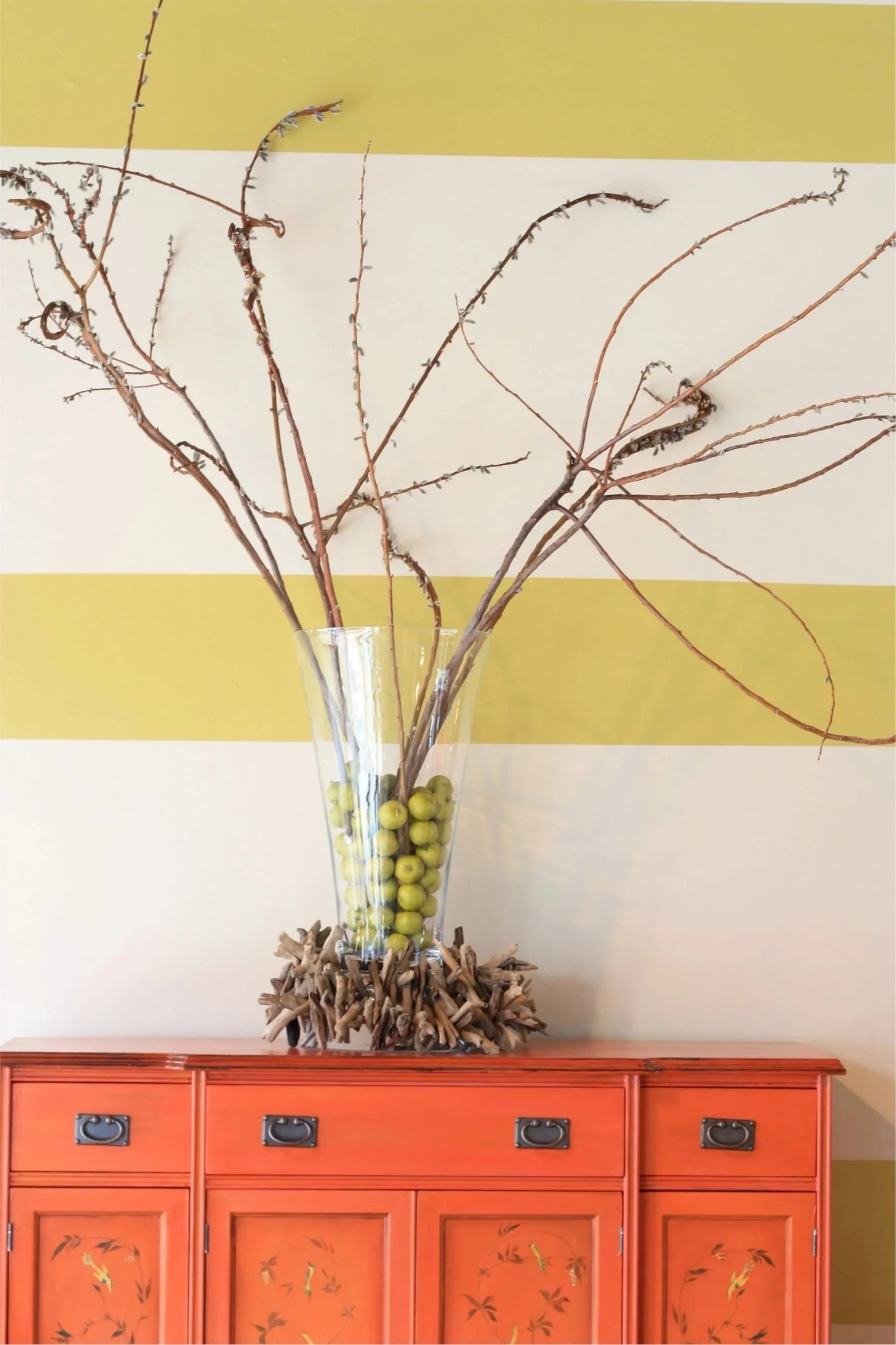
The bright yellows and greens of the wall and the vase against the eye-catching orange chest create an energetic feel.
Color psychology
Color is magical. It has the power not only to transform a space but also to influence how we feel and behave within it. In the centuries-old study of color psychology, each hue carries its own emotional signature. When designing a room, consider its purpose and the mood you want to cultivate, then choose colors that bring that feeling to life.
Beyond aesthetics, color psychology in interior design plays a major role in how a home feels. The colors you live with every day influence mood, stress levels, focus, and emotional comfort, often without you consciously noticing. For many people, this influence is felt most strongly when they’re trying to choose a paint process that can quickly become overwhelming.
Color affects mood and emotion:
| Color | Emotional Influence | How to Use It |
|---|---|---|
| Orange | Warmth, innovation, friendliness, energy | Use as an accent to energize creative or social spaces |
| Yellow | Joy, creativity, optimism | Ideal for kitchens, breakfast areas, or spaces needing brightness |
| Green | Health, nature, growth, renewal, peace | Perfect for living rooms, kitchens, or spaces connected to nature |
| Pink | Balance, compassion, creativity, serenity | Works beautifully in bedrooms, bathrooms, or as a soft accent |
| Purple | Luxury, spirituality, sensuality | Use in doses to add richness and drama to intimate spaces |
| Red | Energy, passion, stimulation | Perfect for dining rooms/social spaces; encourages appetite/conversation |
| Brown | Comfort, security, reliability, stability | Use as grounding neutrals in furniture, flooring, and wood tones |
| Blue | Contentment, stability, focus, tranquility, calm | Ideal for bedrooms, offices, or areas to encourage relaxation |
| Black | Formality, sophistication, strength, grounding | Use sparingly to add elegance and depth |
| Metallic | Reflective, luxurious, light-enhancing | Incorporate through accessories, wallpaper, or finishes for dimension |
The brain processes color quickly and emotionally. Before you evaluate furniture, layout, or style, your nervous system has already responded to the colors in the space. This is why certain rooms instantly feel calming, grounding, energizing, or overstimulating, even if you can’t immediately explain why. Interior color choices affect emotional regulation by shaping the visual environment your body experiences every day.
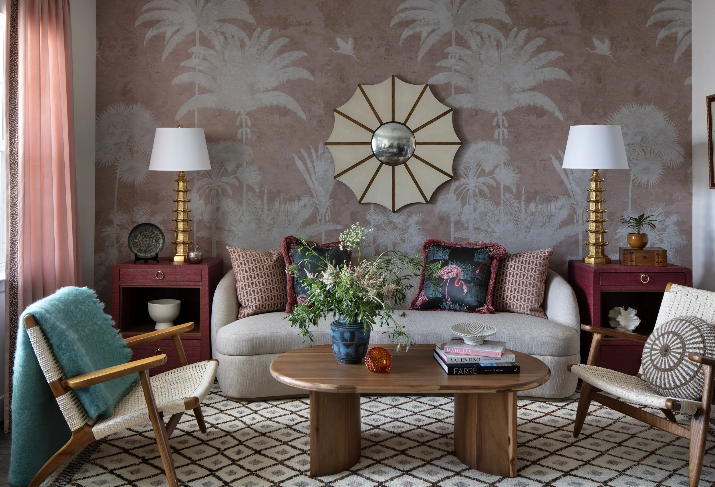
The warm, soft shades of this reading nook interact gracefully with the natural light, inviting you to relax and decompress.
Examining color psychology can bring comfort to your home.
A comfortable home isn’t just visually appealing. It supports how you feel.
Soft, balanced paint colors reduce visual noise and allow the eyes to rest.
Highly saturated or high-contrast colors increase stimulation.
Increased stimulation may feel energizing in some rooms and draining in others.
Emotional comfort depends on how color supports the purpose of the space.
This is often where paint decisions begin to feel stressful. Without a clear emotional framework, choosing between similar shades can trigger doubt and decision fatigue.
Calm homes aren’t always neutral
Neutral paint colors are often associated with calm interiors, but neutrality alone doesn’t guarantee comfort.
Homes feel calm when:
Colors relate to one another
Undertones align
Paint colors flow from room to room
Each space supports how it’s used
Some colorful homes feel deeply grounding.
Some neutral homes still feel unsettled.
Calm comes from coherence — not from avoiding color.
The most effective paint colors often stay in the background:
They don’t demand attention
They allow light to lead
They support furniture and daily life
They reduce visual noise
When color works this way, you stop analyzing your walls and start feeling at ease in your home.
This is often the turning point for people who have struggled with paint decisions — realizing that color doesn’t need to perform or impress to be successful.
-
Yes, the brain naturally and swiftly reacts to colors, often even before we're fully aware of it. Various shades can help promote feelings of calm, boost focus, energize us, or stimulate our senses, depending on their tone and saturation.
-
Begin by thinking about the feelings you want to enjoy in the space. Then, select colors that help create that mood, while also paying attention to the light, flow, and harmony of undertones to make everything feel just right.
-
The Bridget Beari Color Rules book beautifully links emotional comfort with practical color choices, making it easier for you to select paint colors that create a supportive, cohesive, and calming atmosphere in your home.
shift to the bridget beari color rules approach
Instead of asking, “Is this the right color?” try asking, “Does this help me feel the way I want to feel here?”
This shift reduces pressure, builds confidence, and makes choosing color feel calmer, especially for those who have previously felt stuck or overwhelmed by the process.
This understanding is central to the Bridget Beari Colors Rules book.
Rather than focusing on trends, the approach emphasizes emotional comfort, intuitive decision-making, and cohesive color systems that support daily life. If choosing paint has ever felt heavier than it should, the connection between color psychology and overwhelm is worth exploring further, starting with how color affects you emotionally, and continuing with how to make paint decisions feel calm again.
Because your home isn’t just something you see, it’s something your nervous system lives inside.