Color Trends vs. Real Life
What’s trending might not be what’s best for your home.
Color trends move fast. Each year brings a new “must-have” paint color, promising freshness, relevance, and instant style. In photos and showrooms, these trending colors can look striking. But in real homes with real light, real people, and real life, color trends often fail to deliver comfort. This isn’t a personal shortcoming. It’s a structural problem with how trends are designed.
This post discusses why popular paint colors often fall short and how choosing colors based on livability, harmony, and emotional comfort helps create spaces that genuinely last.
the livability gap in color trends
Most interior color trends are created for visibility, not livability. They’re developed to photograph well, feel new quickly, and stand out in a crowded visual landscape. This makes them effective for magazines and social media but unreliable in everyday spaces. Real homes are slower. Messier. More complex. Trends rarely account for that.
One of the main reasons trending paint colors don’t work in real homes is light. Trend palettes are usually presented in ideal conditions: abundant natural light, minimal furnishings, and carefully controlled settings. In real houses, light shifts throughout the day and season. A color that looks balanced online may feel muddy, harsh, or heavy in your actual environment.
Trends Don’t Reflect How You Live
Color trends prioritize appearance over experience.
They don’t ask:
How much time you spend in a room
Whether the space is meant for rest or focus
How you want to feel when you’re there
A bold or dramatic color may look exciting in a photo, but feel overstimulating in a space you live in every day. Keeping up with trends can be quite exhausting. The pressure to stay current encourages constant comparison and second-guessing. Many people describe feeling rushed, anxious, or overwhelmed when choosing paint colors as if they’re falling behind. Stepping away from trends often creates an unexpected sense of relief. When you stop chasing what’s “in,” your body gets to slow down. You can breathe. You can listen to what actually feels supportive rather than what’s being promoted.
Timeless interior color design isn’t about avoiding color. It’s about choosing colors that work with your light, your architecture, and your daily rhythms. Colors chosen this way tend to feel grounded rather than performative, and they age well because they aren’t tied to a moment. Calm comes from coherence, not popularity.
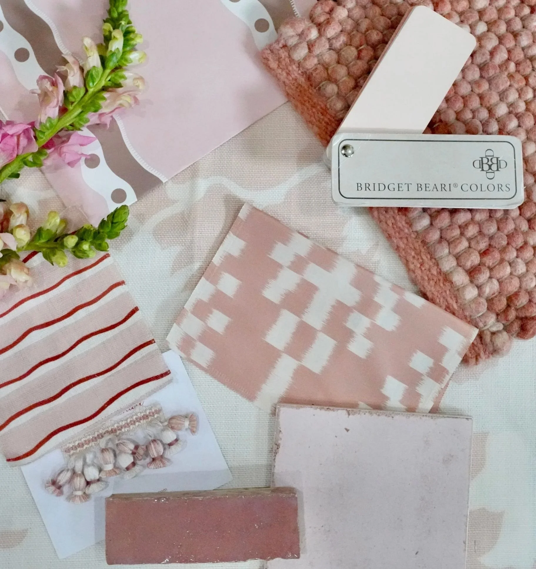
This is the foundation of Bridget Beari Color Rules. Instead of trend-based advice, the book focuses on enduring principles:
undertone alignment
light awareness
emotional comfort
cohesive color systems
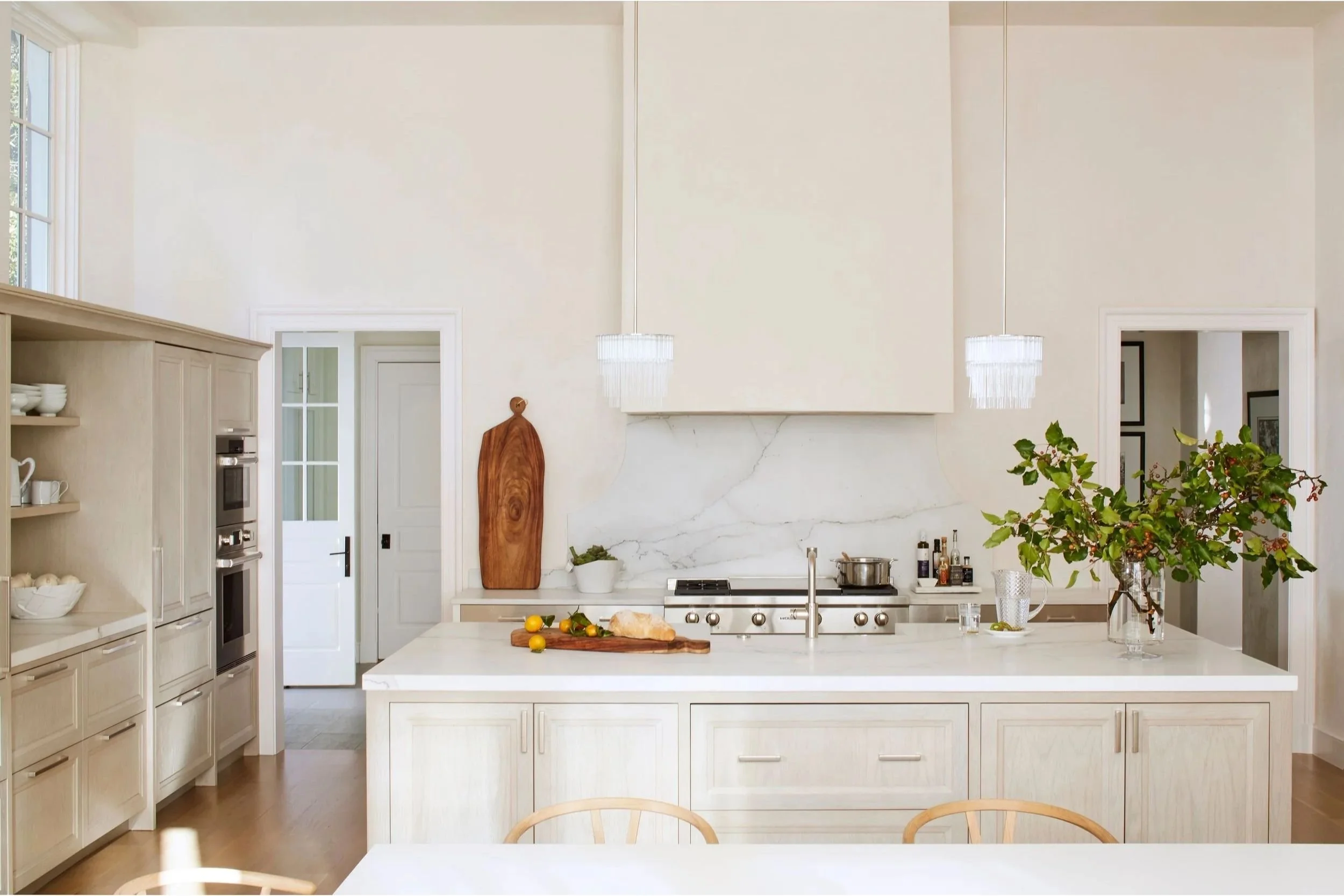
Natural light brightens this creamy, crisp kitchen.
Frequently Asked Questions About Color Trends and Real Homes
-
Trend colors are usually chosen to stand out in photos, not necessarily to work well in real homes. Living spaces have different lighting, furniture, and everyday use, all of which can significantly change how a color appears.
-
Colors shown online or in magazines are typically presented in ideal lighting conditions. In real homes, natural light shifts throughout the day and across seasons, which can make a trending color appear muddy, harsh, or overly intense.
-
The Bridget Beari Color Rules emphasize timeless principles such as matching undertones, understanding light, creating emotional comfort, and developing cohesive color schemes. Instead of following trends, this approach guides homeowners to select colors that are practical and enduring.
These rules don’t change when trends do. They’re designed to support real homes and the people living in them. Letting go of trends isn’t about falling behind. It’s about giving yourself permission to move at a human pace. When you choose color based on comfort and clarity, the process becomes calmer. Decision-making slows. The pressure lifts. Breathing gets easier.
Bridget Beari Color Rules offers a way to choose color that lasts, not because it’s timeless in a decorative sense, but because it’s rooted in how people actually live. Trends come and go. A calm home endures.