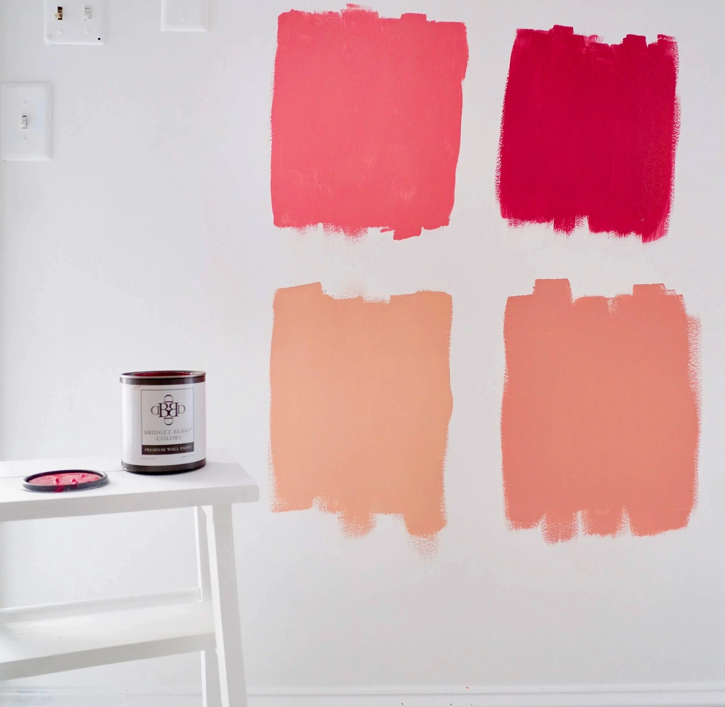
Color Trends vs. Real Life
Color trends may look beautiful online, but do they work in real homes? Learn why timeless paint choices create comfort, cohesion, and calm.
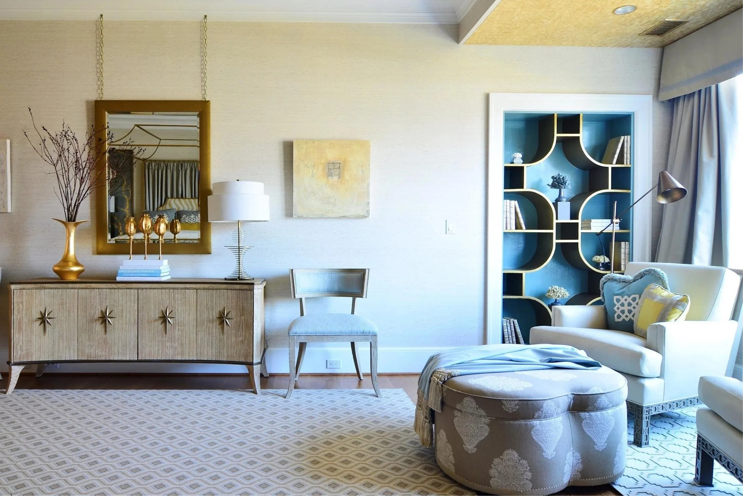
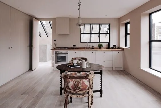
The Feeling of Color
Discover how color psychology affects mood, stress, and comfort at home — and how to choose paint colors that support emotional well-being.
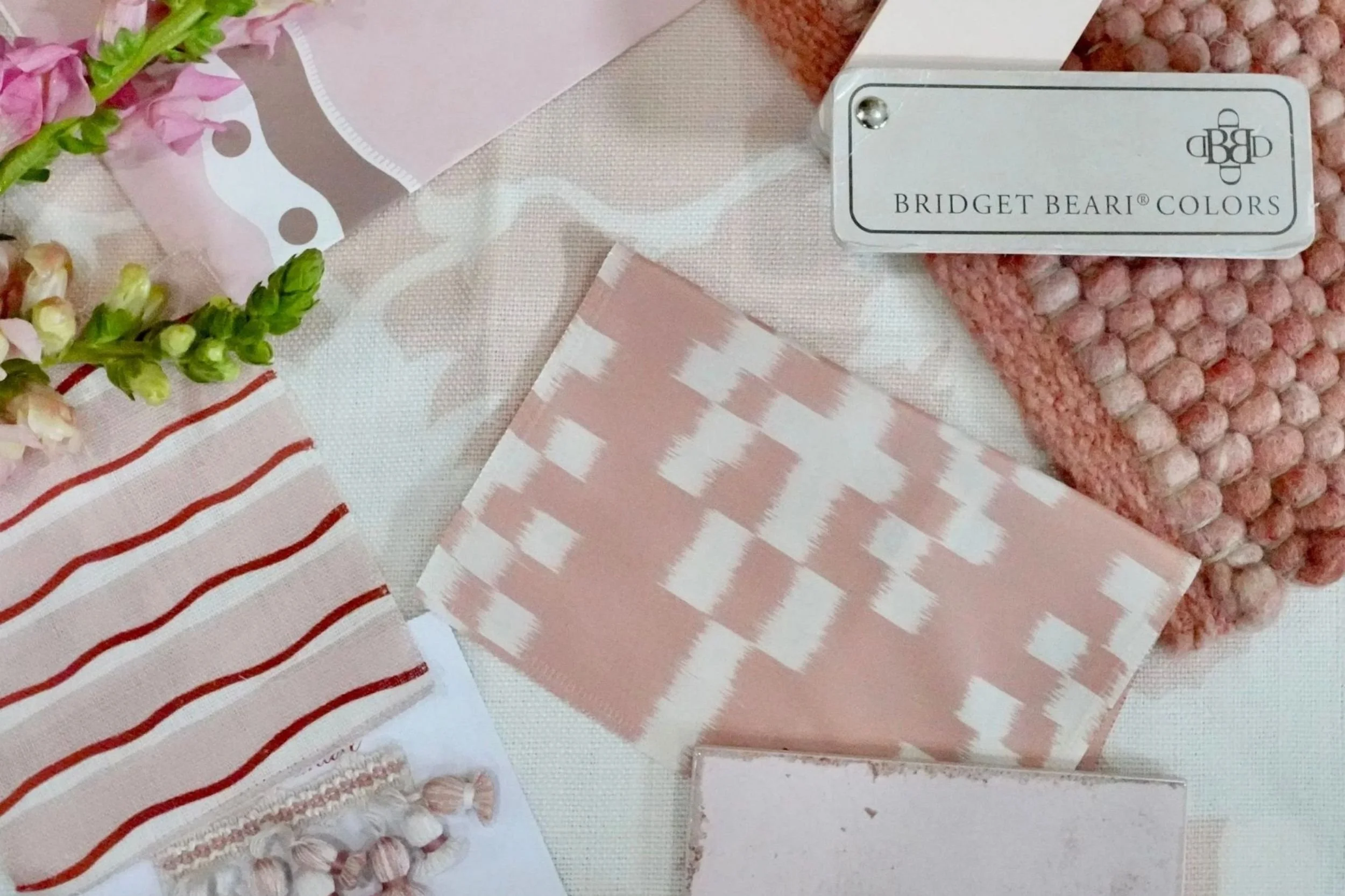
Color Rules for the Color-Shy
Having trouble selecting paint colors? These selected Bridget Beari Color Rules boost confidence, ease overwhelm, and simplify interior color choices.
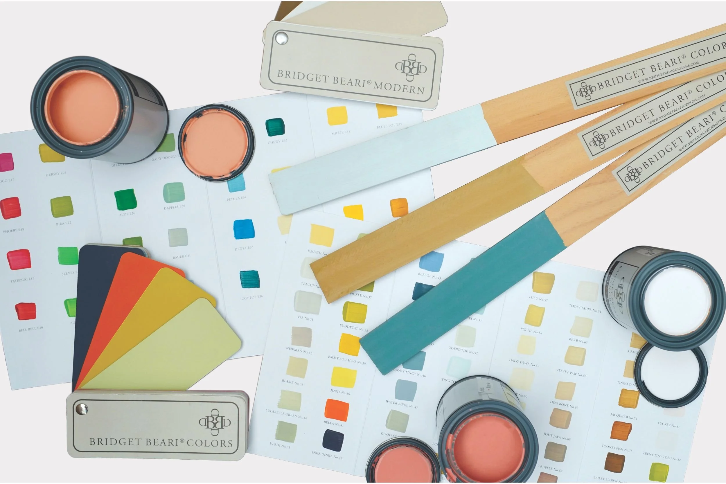
The Story Behind the Bridget Beari Color Rules Book
Discover the story behind the Bridget Beari Color Rules book and learn how a simple, practical framework helps you choose paint colors with confidence.
3 Paint Color Questions That Matter
Struggling to choose the perfect paint color? In this post, Susan Jamieson shares three essential questions that simplify the process, focusing on mood, lighting, and whole-home color flow. Learn how to confidently select paint colors that feel cohesive, intentional, and beautiful in every room.

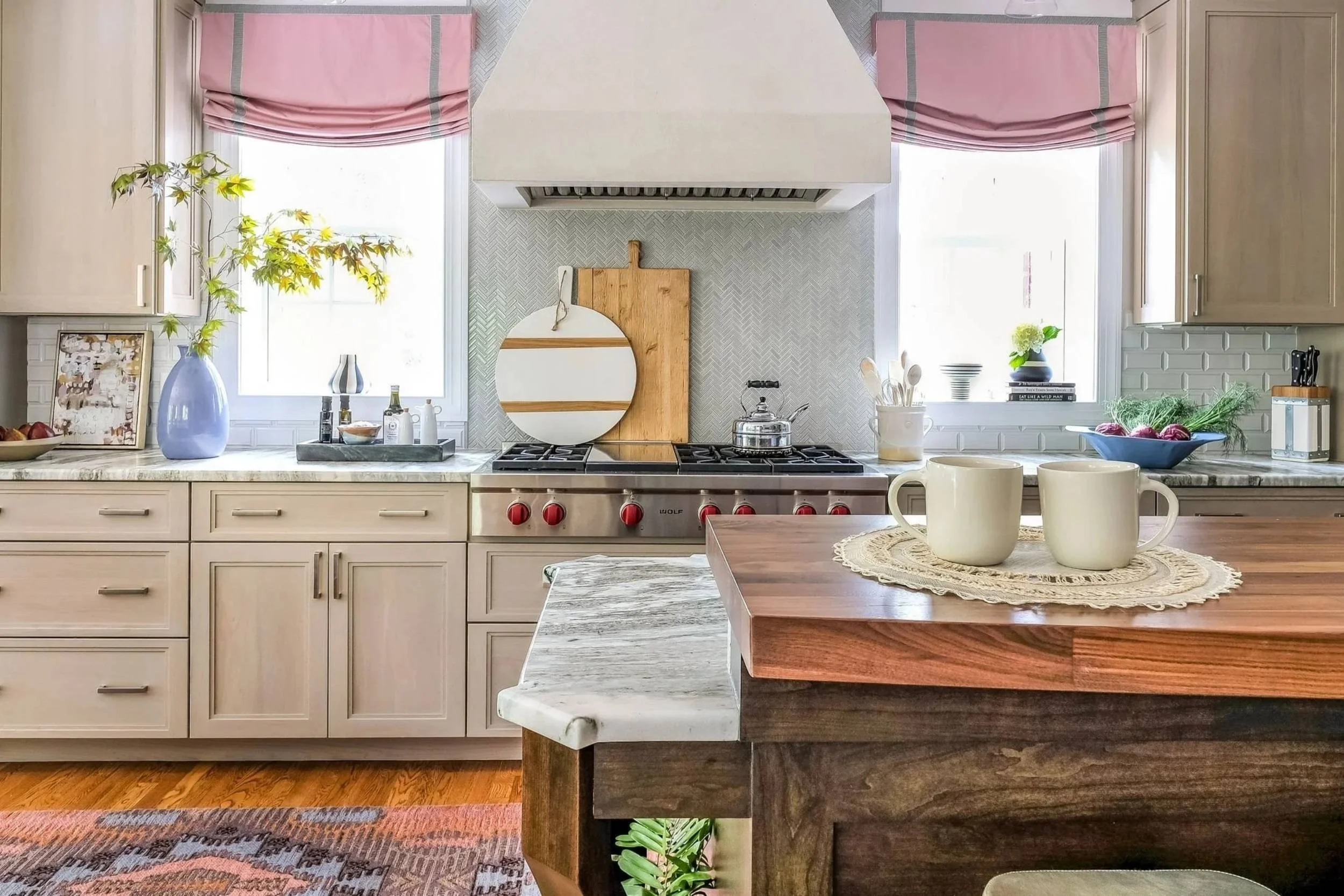
The Paint Color Struggle and How To Make Deciding Easier
Feeling overwhelmed by choosing paint colors? Find straightforward design tips to simplify your choices, set the right mood, and enjoy making color decisions with confidence.

Get The Most Burn From Your Candles
A brief video, sharing my main wax facts to get the most life from your candles: trim the wick trick, find your match, flame timeframe, and freeze to ease!

Bridget Beari Wellness Tip - Brilli Light Bulbs
After months of research, I finally found the perfect LED bulb: Brilli. Honestly, I never liked LED bulbs, especially in recessed cans—until now.
Bridget Beari's Design Chat: What is Wabi Sabi?
At Bridget Beari, I call Wabi Sabi style “Living The Mix”—blending old and new. Antiques, handcrafted objects, and wood tones are key. Never throw anything away before we check its purpose.
Traditional Home Cover Story
I’m thrilled our new Buckhead, Atlanta, build! It was featured by Traditional Home—and even made the cover! Grateful to have another project published.
Hue Are You? with Vicky Serany
Susan M. Jamieson of Bridget Beari Designs interviews interior designer Vicky Serany, from North Carolina. She is the Founder + Principal of Southern Studio.
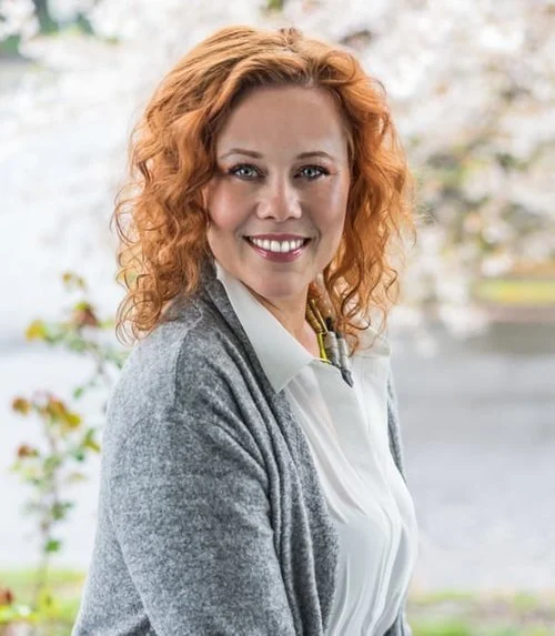
Hue Are You? with Angela Todd
Susan M. Jamieson of Bridget Beari Designs interviews interior designer Angela Todd, from Portland, OR., the Owner/Principal designer of Angela Todd Studios.
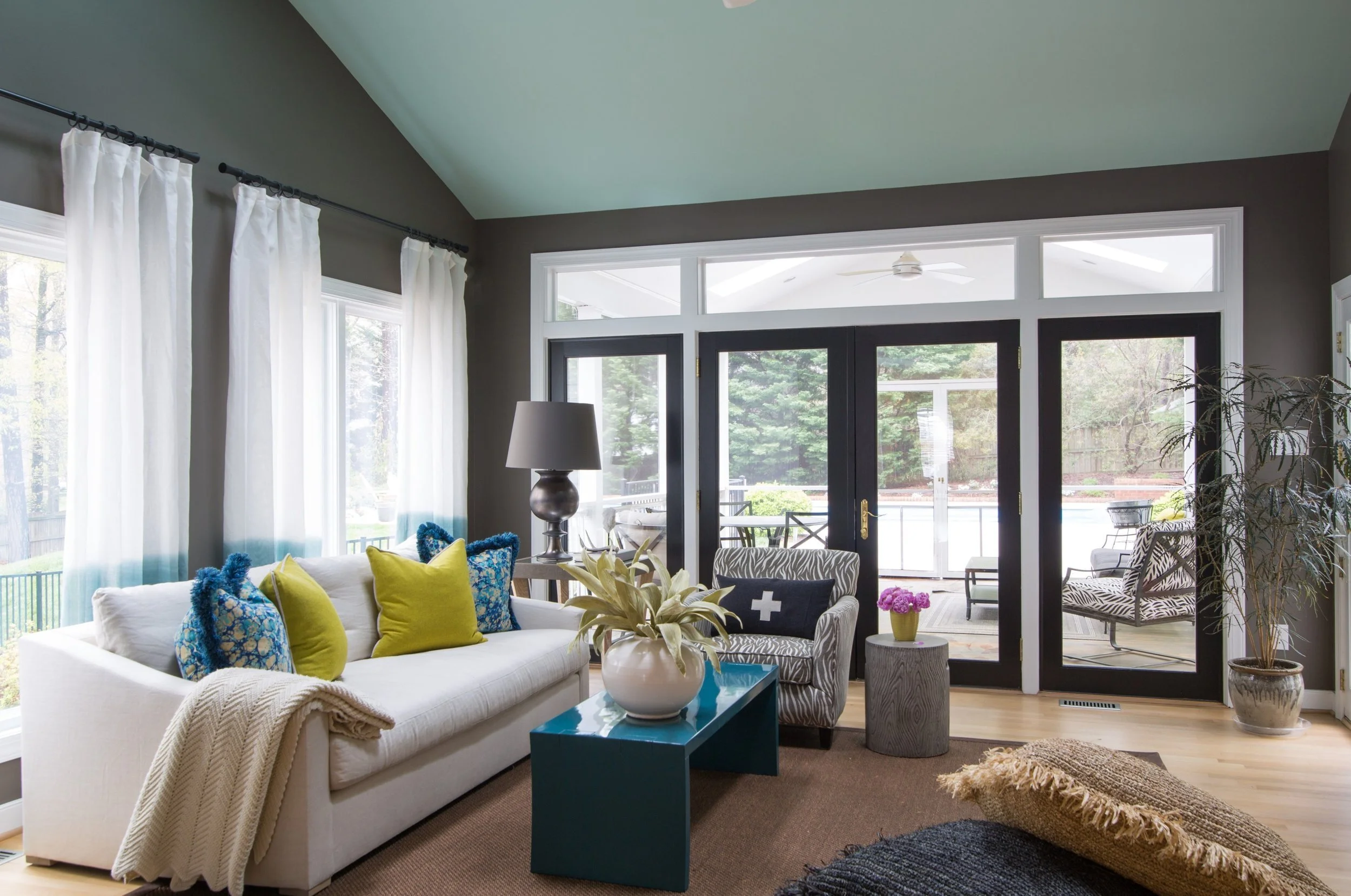
HGTV Designer of the Year Nominee!
Susan M. Jamieson was nominated for HGTV’s Designer of the Year! We transformed an outdated Colonial into a stylish home packed with color and modern amenities.

Hue Are You? Designer Spotlight: Arianne Bellizaire
Susan M. Jamieson of Bridget Beari Designs interviews interior designer Arianne Bellizaire, from Battan Rouge, LA, the Owner of Arianne Bellizaire Interiors.

Hue Are You? Designer Spotlight: Hooper Patterson
Susan M. Jamieson of Bridget Beari Designs interviews interior designer Hooper Patterson, from Wilmington, NC, the Owner of Hooper Patterson Interiors + Build.

Hue Are You? with Regina Sturrock
Susan M. Jamieson of Bridget Beari Designs interviews interior designer Regina Sturrock, from Toronto, Canada, the Owner of Regina Sturrock Designs.
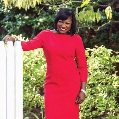
Hue Are You? with Cheryl Luckett
Susan M. Jamieson of Bridget Beari Designs interviews interior designer Cheryl Luckett, from Charlotte, NC, the Owner/Founder of Dwell by Cheryl Interiors.

Hue Are You? with Cheryl Kees Clendenon
Susan M. Jamieson of Bridget Beari Designs interviews interior designer Cheryl Kees Clendenon, from Charlotte, NC, the CEO & Designer of In Detail Interiors.

Hue Are You? with Jeffrey Johnson
Susan M. Jamieson of Bridget Beari Designs interviews interior designer Jeffrey Johnson, from Dallas, TX, the Owner & lead designer of In Jeffrey Design.
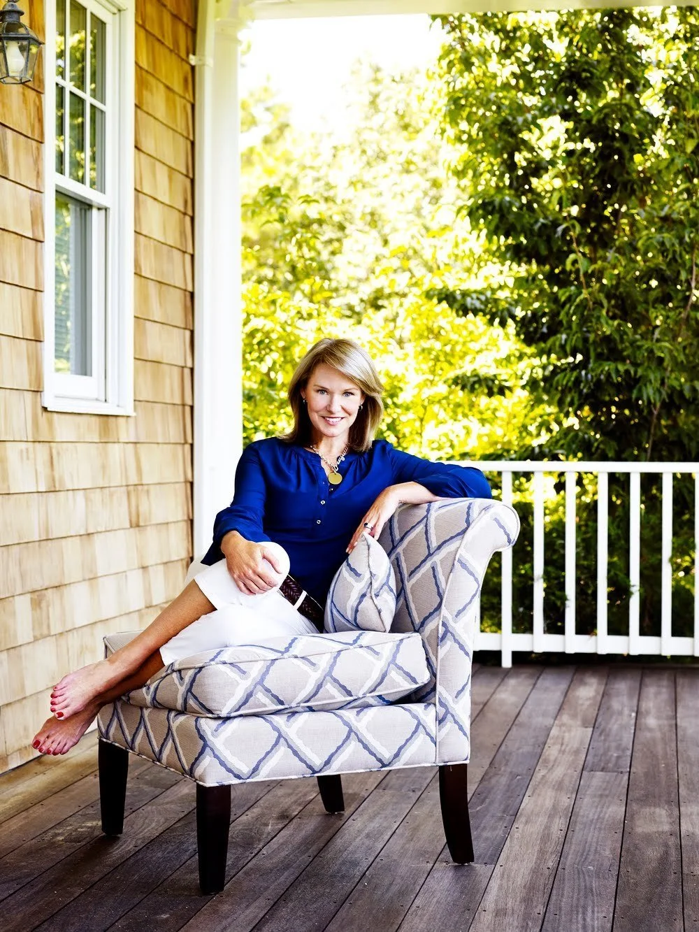
Hue Are You? with Libby Langdon
Susan M. Jamieson of Bridget Beari Designs interviews interior designer Libby Langdon, founder of Libby Langdon Interiors Inc., based in New York, NY.