Bridget Beari Paint Catalog
Have you seen our paint catalog? This is a quick and easy way to see some of our 200 colors in action! From classic blues to exotic reds and even metallics, Bridget Beari Colors gives us that one of kind special colors you have been searching for. We have fan decks for sale and complementary color cards available.
Take a peak I know you will enjoy!


Hue Are You? with Angela Todd

Angela Todd - Portland Oregon Designer

A weekly blog series exploring different creatives' views on color and its use in interiors, art and design. We will dive deep into their obsessions with color. How and why they use color. You will get to know their stories and you may even gather some tips for using color in your own home. What is better than learning from the experts!
Designer Spotlight: Angela Todd
Angela is an interior designer from Portland Oregon who has been designing magnificent interiors in the Northwest since 2007. She believes that every project has its own style, challenges, and framework. Her strength is her ability to create a space with function and beauty, one which is designed within a realistic timeline and budget. She is a live wire full of creativity, passion, drive, and enthusiasm and we can’t wait to share with you her views on color!
Here we go …..
Susan Jamieson: What one color represents your design style?

Angela Todd: I see it as a combination of colors. I am always looking for a multi-colored item like a fabric, a piece or art or even dishware to inspire a project. I ideally like a palette to be grounded in both warm and cool colors. I like rooms best when they have this play of colors on each side of the color wheel.
SJ: Do you use color as a dominant role in your designs or as an accent?

AT: A color palette is the first thing I decide when I begin a project. I feel the colors to use. I don’t know if that is unique to me or not. I think whether to use color as a dominant role or an accent depends on the personality of the client and/or the intended personality of the space.
SJ: How do you feel about matching colors in a room?

AT: I am a fan of bending the rules always and often. I don’t particularly like matching because it can feel contrived, elementary, and planned.

SJ: What color represents your personality?

AT: I am confident and bold like red. I am focused and genuine like blue. I am happy and jovial like orange. I am grounded like green, and I am focused like black. I don’t mean to avoid the question, but truly a multi-colored palette represents me best.
SJ: What color comes to mind when you talk about:

Your Favorite City .......Orange. I went to Quebec City by chance when Mirage Floors invited me to tour their wood manufacturing facility. The city is fortressed and full of amazing history and stone homes from the 17th century. The restaurants and cuisine were unique and memorable, the people were lovely, and the stories of the city and architecture left me promising myself to come back.
The House You Grew Up In .........Blue. My Mom had great taste and could accessorize well, but we had all these things that were just for looks and off limits to use. For example, we had a living room with white carpet that we only used at Christmas and for adult parties. We solely used our dinner china for Sunday dinners and holidays. We had towels and soap in the powder room we couldn’t use. This attitude shaped me. I believe in livable luxury. If you live there, you of all people who enter deserve luxury, so bring out the china, buy the quality towels and say no to the white carpet.
Last Fabulous Dinner You Had ........Gold. Clyde’s is a steakhouse in Portland in East Portland. I kept hearing they had great steak. The exterior of the building doesn’t give you faith. Inside the dining area is surprisingly beautiful. It was the best steak I have ever had in Portland. It is a hidden gem.
Your Favorite Flower .......Pink. Dahlias, and anything that looks good in a bouquet!
Your Favorite Season ......Green. Springtime. It reminds me of renewal, rebirth, second chances and hope.
Your Favorite Art ......Multi-Color.
I think what often makes art special is a story associated with the piece. I have an oil painting of the Columbia River Gorge in my bedroom. A friend who was great at many creative pursuits painted it. I attended a gallery opening for his work 17 years ago and bought it on the spot. It was out of my comfort zone at the time, but it spoke to me. The colors are complex, oranges, pinks, golds, blues, greens and neutrals of the landscape. Secondly, I have watercolor print of blue boy and pink lady that my Grandma Margaret always had in her bathroom. I remember seeing them often as a little girl in her bathroom in Michigan and later in Florida where she retired. Today they hang in my master bathroom above the toilet as they did hers. They are probably dime store items, but they mean a lot to me.
Your Favorite Room in Your Home .....Black and White.
The nook in my kitchen was formerly the back porch of my 1916 foursquare home. It faces east and is full of sunlight each morning. It is magical. As I look at what I love about homes I design, it is generally the room with challenges in architecture, the quirky, or the unusual. Those become the best spaces because they aren’t predictable
Your Favorite Beauty Product ....Multi-colored like the containers!
I have been using Drunk Elephant skincare for a few months and it is truly amazing!
Your Favorite Article of Clothing ......Blue.
This time of the year my garden boots. I slip them on each morning and walk my garden, while I do light weeding and think about my to do list for the day.
SJ: Name a color you never use?

AT: I can’t use Burgundy. I can hardly spell it, let alone use it. Well maybe I could use it, but I wouldn’t call it burgundy.

SJ: Name a color you use frequently?

AT: I think there is green in every project I have ever completed, but it isn’t always obvious at a glance.
SJ: If you could pick a name for a color what would it be?

AT: How about Portland? It would be a complex shade of green!
SJ: Do you have a pet? What color reminds you of him/her? Do you have a nickname for this pet?

AT: Sugar is my English cream and I associate her with Pink like her cute little nose. Finnegan, who I regularly call Finn, is my red golden retriever and he favors blue.
SJ: What is the Now Neutral?

AT: Remember A-E-I-O-U and sometimes Y? Green is like that for me. Black, White, Gray, Chocolate, Cream and sometimes Green.
SJ: What is your prediction for the next big color trend?
AT: I see saturated jewel tones in the purple and red family and hot accents of ochre yellow coming into trend. However, I am still enthusiastically enjoying blushes of pink. So let’s wait a while shall we?
SJ: What are the best color combinations?

AT: It depends on the mood you want to convey. From my perspective, complementary colors give an energy to a space. While monochromatic rooms are serene and peaceful, and analogous color schemes tend to feel restful. However, I feel like almost any mood can be achieved with any color combination if I you dial up or down the values of the colors. It is a lot like how the sky changes throughout the day and night. Dawn breaking, high noon, sunset and twilight all have multiple colors in the atmosphere, but the mood is totally different because of the value and saturation of the colors.
SJ: Best advise when it comes to picking paint colors?

AT:
1) In the most successfully designed spaces the color on the wall isn’t the first thing you notice. It is the supporting cast.
2) Colors change based on what is surrounding them. This includes other colors, wood tones, and natural and artificial light.
3) Don’t pick your paint color first. It should be one of your last decisions.
4) When in doubt call someone who has picked a paint color hundreds of times more than you.

________________________________________________________________________

Hue Are You? with Tamara Stephenson

Tamara Stephenson - New York Interior Designer
A weekly blog series exploring different creatives' views on color and its use in interiors, art and design. We will dive deep into their obsessions with color. How and why they use color. You will get to know their stories and you may even gather some tips for using color in your own home. What is better than learning from the experts!
Designer Spotlight: Tamara Stephenson
Our guest today is New York interior designer, blogger and product designer, Tamara Stephenson. She writes the popular design and lifestyle blog called Nest by Tamara and is also the co-owner of Root Cellar textiles which produces wallpapers and fabrics for the design trade. She describes her design aesthetic as " Sophisticated Cottage " A combination of modern furnishings, accessories and eclectic art with antiques and vintage finds. I love hearing how product designer's view color differently from interior designers. Do products tend toward color trends more than interiors?
Let's find out from Tamara.
Susan Jamieson: What one color represents your design style?
Tamara Stephenson: Emerald Green
Jewel tones like emerald are a bold design statement, they are rich yet immediately create a positive energy in a home. I strongly believe in the medicinal value of color, and choosing the right hue for the space can transform the ambiance. I like to incorporate vibrant color in my designs-- sometimes as the primary color (painted walls), while other times as an accent color through the fabric choices or accessories. Emerald green is a perfect color for both uses. However, a home should not be one bright color after another, and nuanced and sophisticated use of color in a home can be tricky business, but when done right it defines the space. Combining neutrals with vibrant colors or soothing colors creates that balance. I painted my living room in New York City a rich green over 12 years and I have not tired of it! I finished off the room with lacquered white trim and fireplace and placed a black starburst over sized mirror over the fireplace. The juxtaposition of these neutrals allow the emerald color to shine. I use the mantel to display my American white pottery.
“A beautiful home starts with one that is rich in detail, divulging the passions of the dwellers, bit by bit. Living purposefully, and taking notice
of your surroundings and feeling grateful for it.”

Emerald green pillow in root cellar designs’ willow pattern

My emerald green painted living room in NYC
SJ: Do you use color as a dominant role in your designs or as an accent?
TS: Definitely color plays a dominant role in all my designs from my fabric and wallpaper designs to my interior design. It sets the stage for the rest of the composition, and I often start with the palette first then we go from there. Color brings the design to light and has a huge impact on the overall perspective.

East Hampton beach-house master bedroom
the paint color is the same hue as the blue and white toile- so in this case we used tone
on tone, all one color
SJ: How do you feel about matching colors in a room?
TS:I’m generally not into matching colors, but instead I layer (sometimes varying versions of the same hue while other times contrasting colors) I like unexpected pops of color and unusual pairings. The juxtaposition of a grey painted wall with pops of red or bursts of cobalt allows the eye the right amount of movement between color and neutrality. The one time I like matching colors is occasionally I will decorate an all-one color palette in a bedroom, like my master bedroom in our beach house in East Hampton which is all the same cerulean blue (painted on the walls, the same color on the blue and white toile fabric which we upholstered on the bed, bed skirt, pillows, settee and curtains). This tone on tone of the same color in this instance gives a soothing, relaxing feel to this cottage. When choosing color, the use of the space is an important factor. For instance, for bedrooms I like to use calming or cocooning colors that encourage sleep and calm, a safe haven-- it can be dark and moody or light and soothing while a living room and public space, I opt for more energetic palettes- hues that encourage socializing, thought or creativity.
“A happy home starts with the homeowners taking notice and enjoying these details everyday— setting a pretty table, putting out fresh flowers, arranging and editing small collections and vignettes.”
SJ: What color represents your personality?
TS: Tiffany Blue-- it’s a happy color and at once bold and versatile as well as soothing and nurturing. It’s not typical and it’s stylish and sophisticated yet it “plays nicely” with other palettes. It feels of many time periods, yet it’s fresh and modern as well. If I were a color, I’d definitely be Tiffany Blue. It’s the paint color in my Master bedroom in New York City, and when I enter the bedroom, it immediately makes me happy. I have used it in many client’s homes. It works equally well with white, grey, navy, brown or black. It feels comfortable in an urban, country or beach setting, and that versatility is just like me!
SJ: What color comes to mind when you talk about:
Your favorite city-- Black
My home town New York City-- when I think of New York and color, I immediately think of the sophisticated little black dress and how chic that is, a staple in every stylish woman’s wardrobe. I love black cabinetry in a home, either painted bookshelves flanking a fireplace or matte painted kitchen cabinets. Who doesn’t love a hexagon black and white tiled bathroom floor? It feels very quintessentially old world New York.
The house you grew up in: Seagull Grey
We moved several times growing up -- and we lived in unique places from a historic sea captain’s home in Port Jefferson, Long Island overlooking the harbor to a converted, historic barn on a mountain top in Vermont. My mother was an artist and painter and loved color, and she used grey often as a backdrop to offset her fastidious palette. In our sea captain’s home, she painted the large, rambling kitchen wainscoting a gull grey then the wall above it and the walk in food pantry a buttery yellow. Even today, I enjoy using grey and it reminds me of my childhood. I have used some form of grey in almost every home I’ve decorated. In a recent Park Avenue apartment I painted the walls three different shades of grey in three adjoining rooms from darker to light beginning with the study a lacquered smoky grey, then ending with a pale grey in the living room...it created an ombre effect and was stunning. My dining room/kitchen in East Hampton (where we have vaulted ceilings) I painted a medium gull grey above the wainscoting and the wainscoting a fresh white below. Here the grey and white are the perfect backdrop for pops of color and the white wainscoting below keeps it fresh and perfect for a beach house.


Last fabulous dinner you had-- predominant color, Red.
We hosted a dinner party in summer, and whipped up a fruity sangria, prepared enchiladas and served fire engine hot fresh salsa, set the table with a red white and blue with antique red lanterns lining the table, and blue hydrangeas picked from my garden

Al fresco dinner party with blues, white and lots of red
Your favorite flower-- I love so many flowers but I have a special place in my heart
for lilacs, so lavender. Lilacs bloom for a short time in May and they are very
fragrant-- reminding me of the tree growing out my bedroom window in Vermont.
Your favorite season-- summer, Cerulean Blue
The color of the ocean, swimming pools and the big summer sky. It reminds me of East Hampton, my happy place in the world.
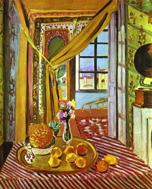
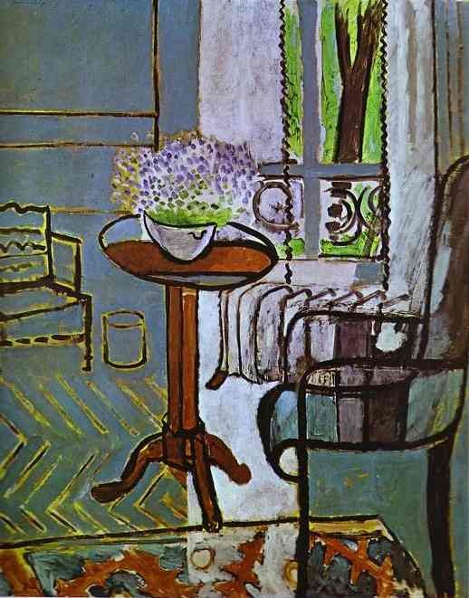
Your favorite art-- I love Henri Matisse
He is a master colorist and painted many interiors throughout his life. My two
favorite-- interiors with phonograph (left); the window(right)
Your favorite room in a home-- a Minty Green guest bedroom.
I find myself gravitating to the guest bedroom in a home because I enjoy hosting guests myself. Clients often give a lot of thought to making guests feel welcome, so it is sometimes the most well designed room in a home. It is great fun to pack this space with all the accouterments necessary for a fantastic stay away from home, and I love it that the guest bedroom can be less cluttered than other rooms, it is a fantasy space of sorts. I like using minty green, and it is a soothing yet invigorating and inspiring color.


Your favorite beauty product-- lipstick, Pale Pink

Your favorite article of clothing-- my Kelly Green fall coat. It just brightens everything up.
SJ: Name a color you never use?
TS: I love yellows from pale to rich jewel-toned yellows but I’m not a huge fan of the muddy ochre yellow (for interiors). In general, I like clear colors in a home.
SJ: Name a color you use frequently?
TS: All variations of BLUE from rich and deep indigo to pale sky blue. To me, blue is the happiest of colors and instantly makes me want to spend time in a room. I love mixing all the shades of blue together.

Mixing blues from navy to sky together in this industrial space in Sag Harbor.
Blue floral Farrow & Ball wallpaper set the tone for my dining room design
And the abstract painting by Jerry Teters added even more blue interest
SJ: If you could pick a name for a color what would it be?
TS: The most fun part of designing products-- wallpaper and fabric-- is naming them creative titles. These are a few of the new color names we’ve named our latest textile collections-- Summer Glass, Millennial Pink; Prussian, Ocean, Poire, Dark Sky, Stone, Putty, Summer Blues, Minty, Noir, Sky, Pinkish, Saddle, Peacock, Sage, Wheat
SJ: Do you have a pet? What color reminds you of him/her? Do you have a nickname for this pet?

Our Standard Poodle Bridget (bridge-y) by the pool
TS: When I think of Bridget I think of pool blue and grass green because she loved to lounge for hours pool-side at our house in East Hampton, and she especially loved to roll in the grass when she was most happy (which was every day). She was seventeen years old, and sadly passed away this winter of old age.
SJ: What is the now Neutral?
TS: Navy blue.

Navy is like a neutral because it can be combined with almost any color and color combination. I have painted two teen bedroom rooms this color this past year. It feels grown up and sophisticated, regal yet edgy. It can work well with a bright white for simplicity or a burnt orange and lighter blues for a bit more layering. Here it is paired with seagrass wall covering. I painted this guest bedroom ceiling with double height ceilings a blueberry/navy and it immediately brought a bit of cozy to the space.
SJ: What is your prediction for the next big color trend?
TS: If home design follows fashion (as it often does), Lavender. This season I am loving all the effervescent lavender in fashion, and it is a happy/joyful color and now with all the jewel-toned violet that is popular in interior design, I predict the lavender cousin to be making a comeback in homes to pair it with the brighter violet. It’s makes everyone look beautiful to boot!
SJ: What are the best color combinations?
TS: So many, and it’s hard to choose...but my favorites are black and blue (edgy), blue and green (think sky and grass/ocean and forest), pink and green (preppy); blue and white (classic); pink and brown (handsome), grey and blue (regal), grey and red (fun), blue and orange (French)....I could go on and on.

SJ: Best advice when it comes to picking paint colors?
TS: Don’t pick what is trending or popular, pick what you love, what brings you joy and colors you want to live with for a long time.
Tamara Matthews-Stephenson
Interior Designer, author Nest by Tamara blog,
co-owner/creative director wallpaper & textile company,
root cellar designs
Instagram: https://instagram.com/tamarastephenson
https://www.instagram.com/rootcellardesigns/
Twitter: https://twitter.com/nestnestnest
Facebook: https://www.facebook.com/RootCellarDesigns/
https://www.facebook.com/NestbyTamara/
Blog: https://nestnestnest.blogspot.com/
Websites: https://www.nestbytamara.com/
https://www.rootcellardesigns.com/
________________________________________________________________________