

FIVE Color Fixes YOUR HOME NEEDS NOW
When a home feels unsettled, the issue is often a common misstep in applying the principles of color theory.
Here are five color mistakes and simple fixes to restore flow and infuse calm.
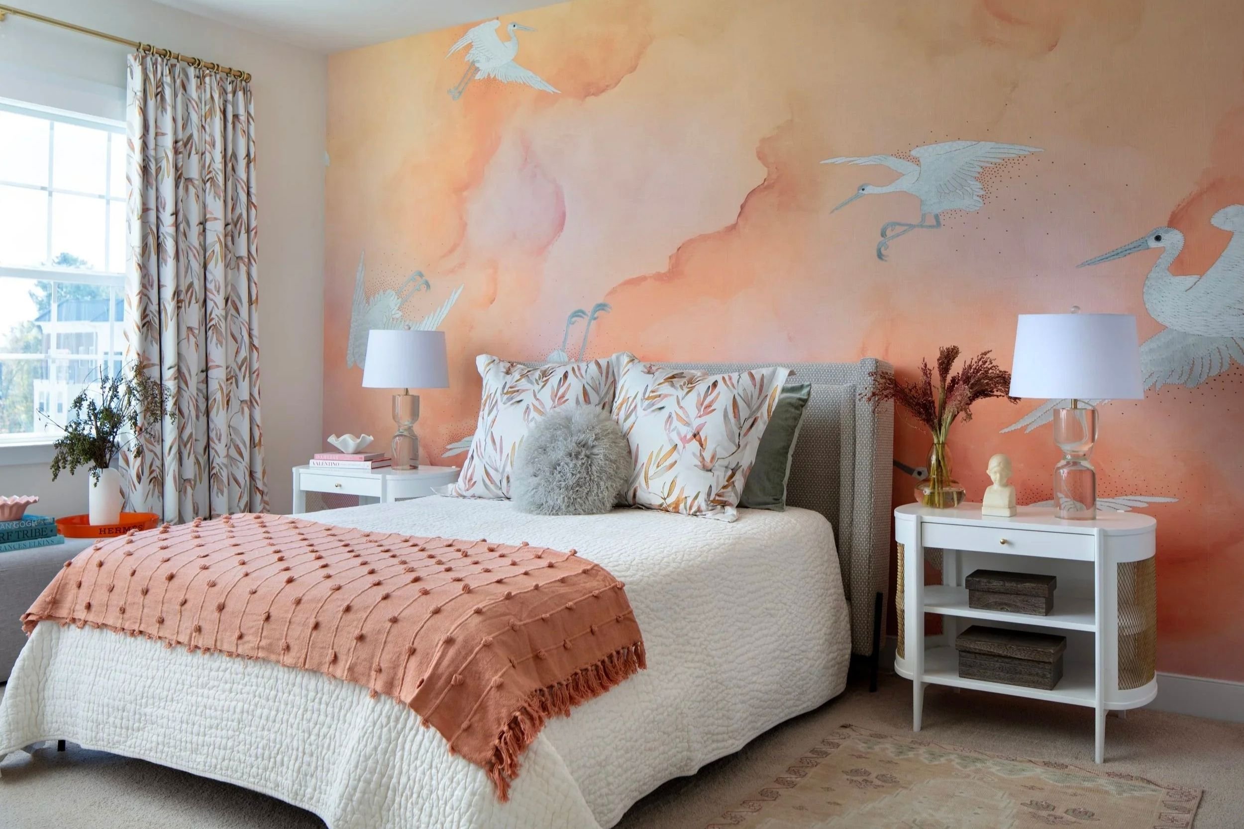
The coral accents in this bedroom create intrigue and warmth without overpowering the space.
COMMON color MIStakes & SIMPLE fixes
When a home feels “off,” it’s easy to assume you chose the wrong paint color or simply lack an eye for design. But most color and design dilemmas aren’t personal—they’re simply the result of common missteps when applying the principles of color theory.
From ignoring the impact of light to unintentionally mixing clashing undertones, small missteps can create tension that’s hard to name but easy to feel. That’s exactly why the Bridget Beari Color Rules book exists: to translate complex color theory into approachable, usable guidance for real homes. Here are five common color mistakes and straightforward solutions rooted in the principles of Bridget Beari Color Rules to help restore balance, flow, and harmony to your home.
Below are five common color mistakes that can make a home feel unsettled, along with solutions and what to do instead:
Mistake #1: Choosing Paint Color Without Considering Light
Paint color never exists on its own. It is always in conversation with light. A color that feels warm and soft in the store can turn dull or harsh at home simply because the light is different. This isn’t a failure of taste; it’s physics.
What to do instead:
In Bridget Beari Color Rules, light is treated as a primary decision-maker, not a footnote. Always test color in the space it will live, and observe it throughout the day. Let light lead the choice.
Mistake #2: Mixing Undertones That Don’t Agree
Homes often feel unsettled when warm and cool undertones are mixed without intention. Creamy walls next to icy trim. Warm beige floors under cool gray paint. Each color might be fine alone, but together they create tension the body feels before the eye understands.
What to do instead:
One of the core principles in Bridget Beari Color Rules is undertone alignment. Choose an undertone direction for a room and let it guide all major color decisions. Whether warm, cool, nuetral, or a thoughtful balance, consistency creates calm.
Mistake #3: Asking Every Color to Be Interesting
When every wall is meant to make a statement, the home never gets to rest. This often happens when people feel unsure of the “rules” and compensate by using bold or high-contrast colors everywhere. The result is visual noise, not confidence.
What to do instead:
The book emphasizes the difference between background colors and feature colors. Most colors should quietly support the space, allowing light, furniture, and life to take the focus.
Mistake #4: Treating Each Room as a Separate Decision
Choosing colors room by room, without considering how they relate, often leads to a disjointed home. Even beautiful colors can feel unsettling when there’s no continuity.
What to do instead:
Bridget Beari Color Rules teaches color as a system, not a series of isolated choices. Repeating and allowing colors to flow from room to room creates a sense of balance and ease.
Mistake #5: Choosing Color Based on Trends
A color that looks good online doesn’t always feel good in person. Trends prioritize visual impact, not emotional comfort, which is why trendy homes can sometimes feel uncomfortable. Choosing colors that you love living with is always on trend.
What to do instead:
The book encourages choosing color based on how a space is used and how you want to feel in it. When function leads, comfort follows.
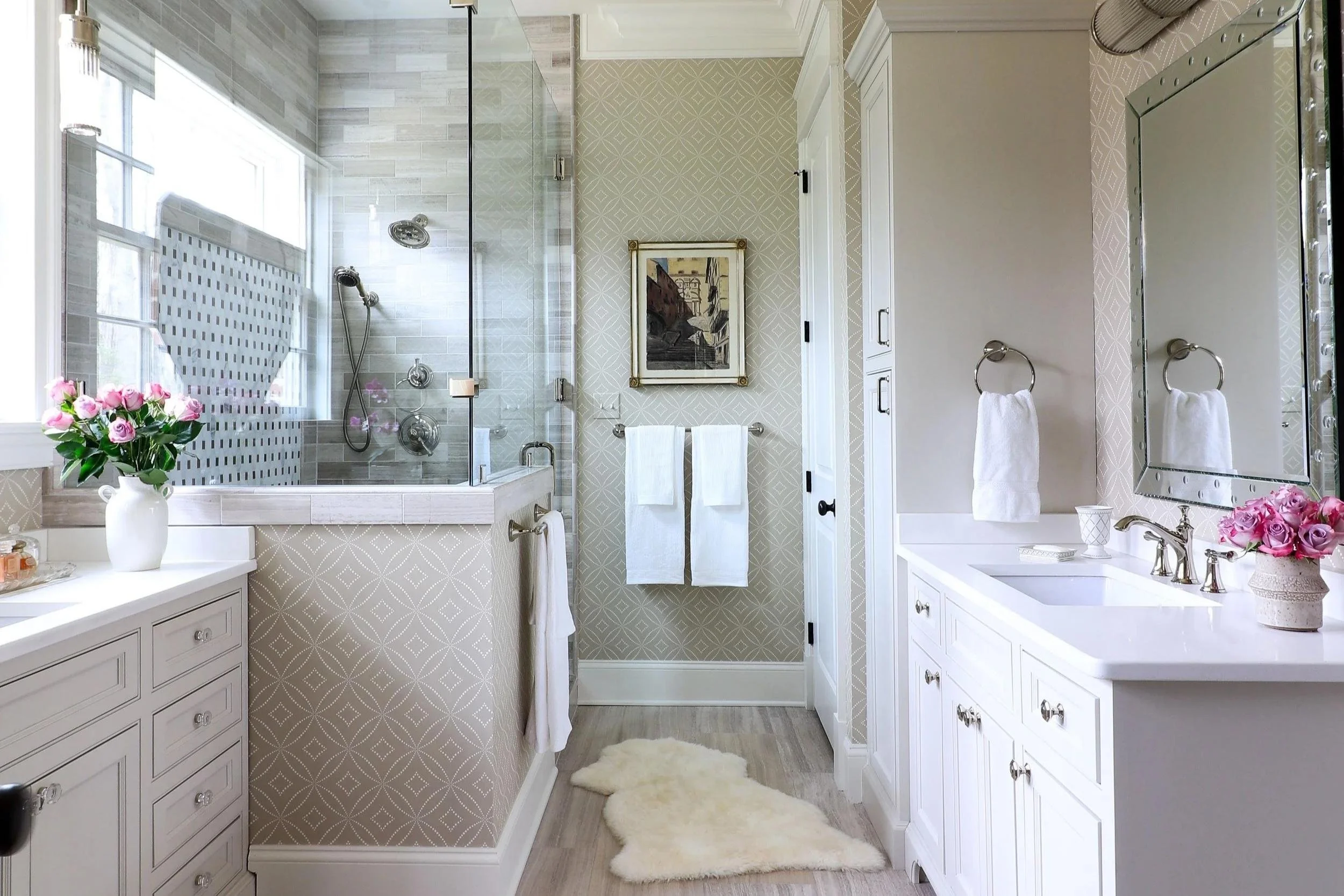
In this bathroom, a neutral beige wallpaper lets the crisp white of the countertops and cabinets pop, creating a clean, bright atmosphere.
-
If a room feels tense or slightly uncomfortable, it may be due to mismatched warm and cool undertones. Harmonizing the undertones of walls, floors, and trim helps create a more balanced and pleasing space.
-
Trends tend to focus on visual appeal rather than everyday practicality. Picking colors based on how you actually use a space and the mood you want to create usually results in more long-lasting comfort.
-
If you’re not sure where to start, the Bridget Beari Color Rules book provides a friendly, practical guide to help bring harmony back to your home.
The Core Idea Behind Bridget Beari Color Rules
If your home feels unsettled, it doesn’t mean you made a bad choice. It means you were never taught the rules, the ones that account for light, undertones, consistency, and emotional experience.
Bridget Beari Color Ruleswas written to make those rules accessible, learnable, and non-intimidating. Color confidence doesn’t come from instinct alone. It comes from understanding the system and trusting yourself enough to use it.