
Hue Are You? with Vicky Serany
Vicky Serany of Southern Studio

A weekly blog series exploring different creatives' views on color and its use in interiors, art and design. We will dive deep into their obsessions with color. How and why they use color. You will get to know their stories and you may even gather some tips for using color in your own home. What is better than learning from the experts!
Designer Spotlight: Vicky Serany
Vicky is an interior designer from Cary North Carolina. She is the, Founder + Principal, of Southern Studio.
Vicky uses fresh combinations of texture, pattern, and color to create luxury interiors that meet the needs of each client. By paying attention to every detail of a project, she is able to meticulously transform the design vision into reality. Her inspiration comes from the beauty in everyday life and travel to fascinating places. Vicky’s extensive work in residential design and new home construction has earned her awards both locally and nationally. Vicky is an Allied Member of the American Society of Interior Designers (ASID) and lives in Cary with her husband, Dan. This empty nest mom jumps at the opportunity to spend time with her two grown children. When she’s not creating inspired interiors, Vicky enjoys spending time at the beach, sharing a bottle of wine with close friends, and exploring new adventures on her bucket list!
Let’s learn about Vicky’s view on color …..
Susan Jamieson: What one color represents your design style?
Vicky Serany: Texture. It’s not a good color answer, but I love almost any color when it includes layers and layers of texture.

SJ: Do you use color as a dominant role in your designs or as an accent?
VS: Accent. A combination of neutrals combined with a splash of color is always a win!

SJ: How do you feel about matching colors in a room?
VS: It’s all about the layers. A room layered with color is always evolving! Carefully combined color values and intensity add interest to a space without being boring.

SJ: What color represents your personality?
VS: Sapphire Blue. Always striving to be sincere, enthusiastic, and compassionate.

SJ: What color comes to mind when you talk about:
Your favorite city: Charcoal Gray
The house you grew up in: Creamy White
Last fabulous dinner you had: Caramel
Your favorite flower: Blush Pink
Your favorite season: Fern Green
Your favorite piece of art: Sea Blue
Your favorite room in a home: Amethyst
Your favorite beauty product: Crisp White
Your favorite article of clothing: Classic Black

SJ: Name a color you never use?
VS: I prefer to never say never, but orange is a color we rarely use. It’s a stimulating color and a little bit goes a long way.

SJ: Name a color you use frequently?
VS: Steel Blue. It’s universally loved and adds peace and calm to a room.

SJ: If you could pick a name for a color what would it be?
VS: Peace. It would be the perfect soft and creamy neutral that brings calm to a space.

SJ: Do you have a pet? What color reminds you of him/her? Do you have a nickname for this pet?
VS: Our all-black rescue pup, Captain Morgan, is always up for adventure.

SJ: What is the now Neutral?
VS: Winter White. It’s soft, serene, and can be layered with a multitude of hues.

SJ: What is your prediction for the next big color trend?
VS: Rich colors like emerald green, peacock blue, and tuscan gold.

SJ: What are the best color combinations?
VS: Right now, I’m loving the combination of sapphire blue and amethyst layered with lots of creams and beiges.

SJ: Best advise when it comes to picking paint colors?
VS: The appearance of a color is affected by surrounding colors. Always consider colors in adjoining spaces as you begin to develop your color palette.

Bridget Beari Holiday Gift Guide 2019
Top 10 Holiday Gifts that are Sure to Please!

Remember those coaster sets our parents use to have? Yeah. These are not those. Made of gray veined marble and accented with a inset brass detail, these coasters not only look good, but…if you use them…your furniture will too. Buy a set for every room. You’ll thank yourself later.
$44.00
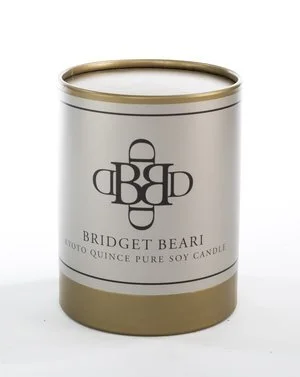
Surround yourself with the scent of Kyoto Quince and Roses and be transported to a calm, soothing world. Made of domestically grown, environmentally sustainable soybeans and hand poured in Saratoga Springs, New York, these lightly fragrant candles will provide you with 80 hours of burn time. Skip the chemical air fresheners and keep one of these in every room of your home.
$35.00

A variation of the 1958 Poul Henningsen lamp, this stunning artichoke hanging lamp will brighten any room you hang it in and bring a smile to your fave. Individual metal plates on a steel frame diffuse the light while the gilded interior creates a warm, soft glow. Modern, yet timeless.
$1895

White and Wood Round Cutting Board
For the gourmet chef in your life, use it for cutting or just styling your kitchen.
$105.00

Nothing better than this light weight handmade throw. Perfect for the beach!
$156.00

Cast in metal using a piece of natural wood as the original form, this stunning lamp deserves a place of honor in your home. Substantial in weight, finished in an antiques silver finish, and mounted on a clear acrylic base, this lamp will elicit oohs and aahs from everyone who sees it.
$692.00

Sometimes, a dinner table needs a bit of elegance. Hand crafted of shimmering gold and grey metallic threads, these medallion place mats bring just the right amount of bling to any table. Traditional in design, modern in feeling. Perfect!
$42.00 each

Twinkle, twinkle little star… how I wonder what you are. Well, wonder no more. This white ceramic star is the perfect accessory for anyone who loves geometric shapes. Crisp and clean, this star will bring your coffee table, book shelf or kitchen island a touch of the heavens.
$88.00

Protect your hands by using these extra long wood fireplace matches. Housed in a ready to re-purpose crystal clear glass container with natural cork lid and strike plate, they are as attractive as they are useful. Made in the USA.
$62.00

Constructed of a warm, caramel brown leather, this Moroccan inspired ottoman is exactly what your feet need at the end of a long day. Lightly detailed with cream stitching. Its durable enough to withstand the test of time…. and your children. They just love ottomans!
$248.00
1528 West Cary Street, Richmond, Virginia
804-967-3103
info@bridgetbeari.com
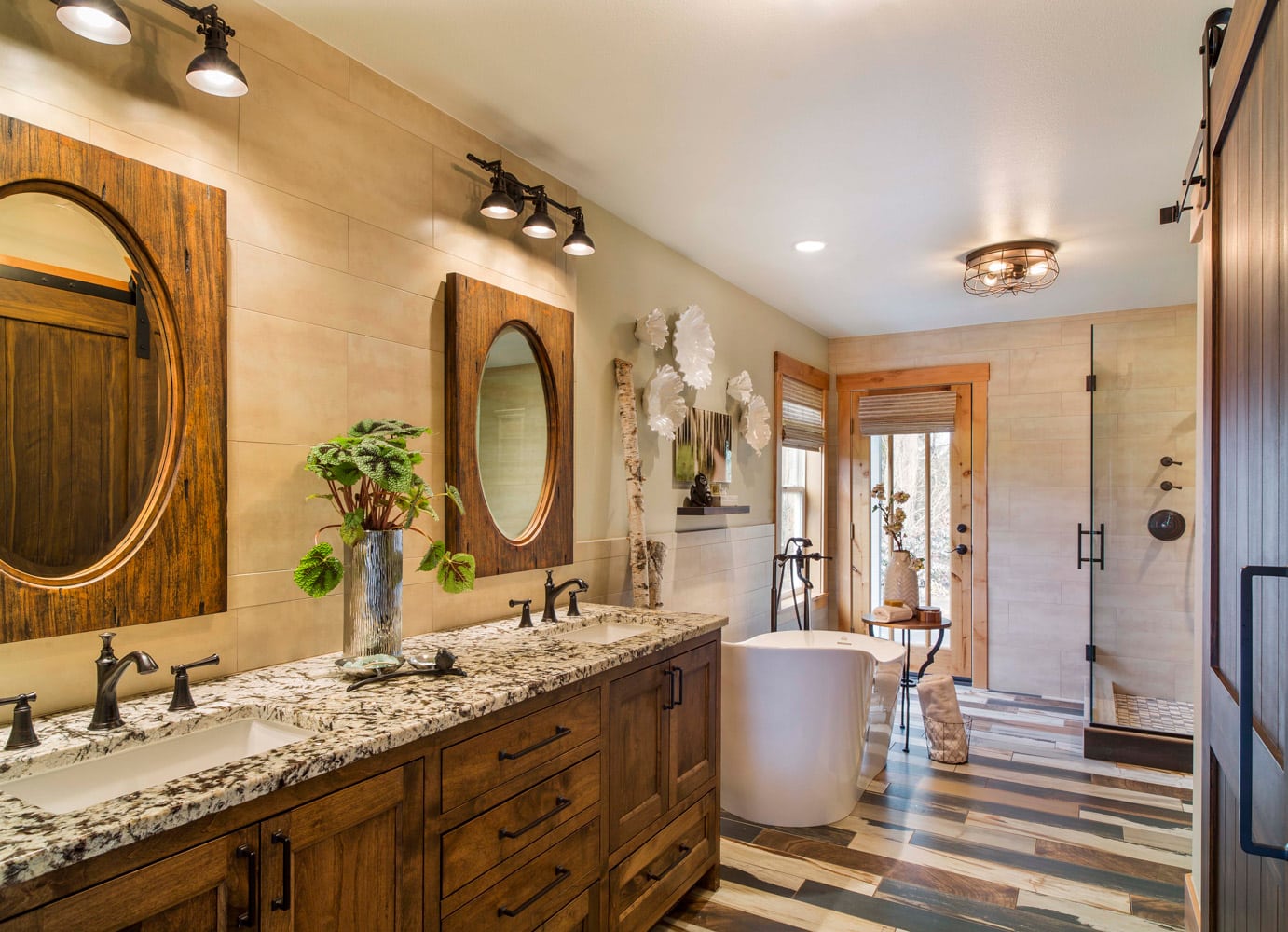
Bridget Beari Color Rule #21 - Tread Lightly With Wood Trim
Bridget Beari Color Rule #21

Wall colors are the hardest to pick with wood trim. You have to be extra aware of what tones are in the wood and how they change the color of the paint you put next to them.
One of the main pitfalls I see is homeowners trying to paint yellow walls next to wood trim that has green in it. It will change your wall color immediately.
Here are some rooms that do it right!
Just enough grey green in that beam to pull off that wall color.

Furniture ad for Bassett Furniture
Picking up the creamy white to accent the colors in the weathered wood.

ACE HOTEL
Beautiful wood beams in this Diane Keaton house. Stucco walls in a grey/white wash highlights the red in the beams with out fighting it.

Architectural Digest
Wood beams and wood cabinets have a ton of orange and yellow in them. The green walls softens the overall mood without using white walls. Green can be really tricky. It can look sick with the yellow of the beams. It is working here but tread lightly!

Another green that might have worked better would be:
Verdi No. 35
It has more grey in it than yellow.

Tip:
Did you know you can fix scratches on furniture with a walnut? Rub the raw walnut on the scratch and it will eliminate the scratch. Especially great for the legs of tables where the vacuum always seems to reek havoc!

Happy Painting….


Hue Are You? with Angela Todd

Angela Todd - Portland Oregon Designer

A weekly blog series exploring different creatives' views on color and its use in interiors, art and design. We will dive deep into their obsessions with color. How and why they use color. You will get to know their stories and you may even gather some tips for using color in your own home. What is better than learning from the experts!
Designer Spotlight: Angela Todd
Angela is an interior designer from Portland Oregon who has been designing magnificent interiors in the Northwest since 2007. She believes that every project has its own style, challenges, and framework. Her strength is her ability to create a space with function and beauty, one which is designed within a realistic timeline and budget. She is a live wire full of creativity, passion, drive, and enthusiasm and we can’t wait to share with you her views on color!
Here we go …..
Susan Jamieson: What one color represents your design style?

Angela Todd: I see it as a combination of colors. I am always looking for a multi-colored item like a fabric, a piece or art or even dishware to inspire a project. I ideally like a palette to be grounded in both warm and cool colors. I like rooms best when they have this play of colors on each side of the color wheel.
SJ: Do you use color as a dominant role in your designs or as an accent?

AT: A color palette is the first thing I decide when I begin a project. I feel the colors to use. I don’t know if that is unique to me or not. I think whether to use color as a dominant role or an accent depends on the personality of the client and/or the intended personality of the space.
SJ: How do you feel about matching colors in a room?

AT: I am a fan of bending the rules always and often. I don’t particularly like matching because it can feel contrived, elementary, and planned.

SJ: What color represents your personality?

AT: I am confident and bold like red. I am focused and genuine like blue. I am happy and jovial like orange. I am grounded like green, and I am focused like black. I don’t mean to avoid the question, but truly a multi-colored palette represents me best.
SJ: What color comes to mind when you talk about:

Your Favorite City .......Orange. I went to Quebec City by chance when Mirage Floors invited me to tour their wood manufacturing facility. The city is fortressed and full of amazing history and stone homes from the 17th century. The restaurants and cuisine were unique and memorable, the people were lovely, and the stories of the city and architecture left me promising myself to come back.
The House You Grew Up In .........Blue. My Mom had great taste and could accessorize well, but we had all these things that were just for looks and off limits to use. For example, we had a living room with white carpet that we only used at Christmas and for adult parties. We solely used our dinner china for Sunday dinners and holidays. We had towels and soap in the powder room we couldn’t use. This attitude shaped me. I believe in livable luxury. If you live there, you of all people who enter deserve luxury, so bring out the china, buy the quality towels and say no to the white carpet.
Last Fabulous Dinner You Had ........Gold. Clyde’s is a steakhouse in Portland in East Portland. I kept hearing they had great steak. The exterior of the building doesn’t give you faith. Inside the dining area is surprisingly beautiful. It was the best steak I have ever had in Portland. It is a hidden gem.
Your Favorite Flower .......Pink. Dahlias, and anything that looks good in a bouquet!
Your Favorite Season ......Green. Springtime. It reminds me of renewal, rebirth, second chances and hope.
Your Favorite Art ......Multi-Color.
I think what often makes art special is a story associated with the piece. I have an oil painting of the Columbia River Gorge in my bedroom. A friend who was great at many creative pursuits painted it. I attended a gallery opening for his work 17 years ago and bought it on the spot. It was out of my comfort zone at the time, but it spoke to me. The colors are complex, oranges, pinks, golds, blues, greens and neutrals of the landscape. Secondly, I have watercolor print of blue boy and pink lady that my Grandma Margaret always had in her bathroom. I remember seeing them often as a little girl in her bathroom in Michigan and later in Florida where she retired. Today they hang in my master bathroom above the toilet as they did hers. They are probably dime store items, but they mean a lot to me.
Your Favorite Room in Your Home .....Black and White.
The nook in my kitchen was formerly the back porch of my 1916 foursquare home. It faces east and is full of sunlight each morning. It is magical. As I look at what I love about homes I design, it is generally the room with challenges in architecture, the quirky, or the unusual. Those become the best spaces because they aren’t predictable
Your Favorite Beauty Product ....Multi-colored like the containers!
I have been using Drunk Elephant skincare for a few months and it is truly amazing!
Your Favorite Article of Clothing ......Blue.
This time of the year my garden boots. I slip them on each morning and walk my garden, while I do light weeding and think about my to do list for the day.
SJ: Name a color you never use?

AT: I can’t use Burgundy. I can hardly spell it, let alone use it. Well maybe I could use it, but I wouldn’t call it burgundy.

SJ: Name a color you use frequently?

AT: I think there is green in every project I have ever completed, but it isn’t always obvious at a glance.
SJ: If you could pick a name for a color what would it be?

AT: How about Portland? It would be a complex shade of green!
SJ: Do you have a pet? What color reminds you of him/her? Do you have a nickname for this pet?

AT: Sugar is my English cream and I associate her with Pink like her cute little nose. Finnegan, who I regularly call Finn, is my red golden retriever and he favors blue.
SJ: What is the Now Neutral?

AT: Remember A-E-I-O-U and sometimes Y? Green is like that for me. Black, White, Gray, Chocolate, Cream and sometimes Green.
SJ: What is your prediction for the next big color trend?
AT: I see saturated jewel tones in the purple and red family and hot accents of ochre yellow coming into trend. However, I am still enthusiastically enjoying blushes of pink. So let’s wait a while shall we?
SJ: What are the best color combinations?

AT: It depends on the mood you want to convey. From my perspective, complementary colors give an energy to a space. While monochromatic rooms are serene and peaceful, and analogous color schemes tend to feel restful. However, I feel like almost any mood can be achieved with any color combination if I you dial up or down the values of the colors. It is a lot like how the sky changes throughout the day and night. Dawn breaking, high noon, sunset and twilight all have multiple colors in the atmosphere, but the mood is totally different because of the value and saturation of the colors.
SJ: Best advise when it comes to picking paint colors?

AT:
1) In the most successfully designed spaces the color on the wall isn’t the first thing you notice. It is the supporting cast.
2) Colors change based on what is surrounding them. This includes other colors, wood tones, and natural and artificial light.
3) Don’t pick your paint color first. It should be one of your last decisions.
4) When in doubt call someone who has picked a paint color hundreds of times more than you.

________________________________________________________________________