Hue Are You? Designer Spotlight: Hooper Patterson

A weekly blog series exploring different creatives' views on color and its use in interiors, art and design. We will dive deep into their obsessions with color. How and why they use color. You will get to know their stories and you may even gather some tips for using color in your own home. What is better than learning from the experts!
Hooper is an interior designer with office locations in both Wilmington North Carolina and Chicago. Her projects are diverse in style, geographic location and budget. Specializing in mixing patterns and texture, Hooper's style has been described as "traditional with a twist" and includes a "current, yet timeless, Southern Bent."
Let's hear how this Southern girl uses color and how her recent move to the windy city has influenced her.
Susan Jamieson: What one color represents your design style?
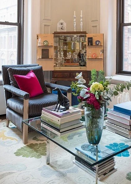
Hooper Patterson: I love blush tones. They are neutrals, warm and feminine. I love how they glow with natural light, candlelight and how they pop with crisp white trim. Blush tones are beautiful with grays, saturated colors like peacock and artwork really shines with blush as a backdrop.

SJ: Do you use color as a dominant role in your designs or as an accent?
HP: I see it as an accent. I love bold color in fabrics, wallpaper or carpets. Pops of color, layered with pillows, throws, lamps and artwork add the personality to a space.

SJ: How do you feel about matching colors in a room?
HP: I don't prefer to match. I know clients often feel comfortable when colors, furniture and fabrics match. I find it to feel too much like a showroom - it seems to lack character. When you can pull colors that compliment and contrast, you create a space that feels more collected and tells a story.

SJ: What color represents your personality?
HP: I love green - the bright leafy green. It has always been one of my favorite colors. It pulls from the outdoors, can be punchy and still feels organic and fresh, all at the same time.

SJ: What color comes to mind when you talk about:
Your favorite City .......right now, we are living in Chicago for my husbands job. It is winter, so gray comes to mind. However, we live on Lake Michigan. We just moved from Wilmington, NC, my hometown. It is on the coast. As long as I am looking at the water, I feel at home. There are days in the winter, when the Atlantic and the Lake have a dark blue undertone. I love that saturated smokey blue. In the Summer, the rich aqua of the Atlantic (and a color, I am hoping to see this Summer in Chicago) is one of my favorite hues. It exudes coastal living - wherever you are. It also exudes warmth - something this Southern girl will be ready for!

The House You Grew Up In .........The house you grew up in: We had a kitchen in my early childhood home that had mustard cabinets. It was the early 80's and it still scars me to this day. It is a color I am hesitant to use. Who knows, maybe my mom was on trend at the time?
Last Fabulous Dinner You Had ........It was last night. I ordered a pasta with pesto and the bright leafy green sauce was not only delicious but one of my favorite hues.
Your favorite Flower .......
My favorite flower is the Daffodil. When I was a child, my uncle had a daffodil farm. We picked them as children and it has always been a promenade flower at the centerpiece of family gatherings, weddings and most recently, at my grandmother's funeral. That flower and bright yellow hue always bring a smile to my face because it reminds me of my "Mimi" - she loved them and to this day, every time I see them, I think of her.
Your favorite season ......
Many hues of Blue - Summertime. Growing up at the beach, we spend summers on the water - swimming, boating, shelling. I get to work on a lot of homes on the coast and clients always request hues that can be found in the sea. Blues, aquas and everything in between remind me of my favorite season.... Summer!

Your Favorite Art ......
makes me think of gold.... Last year, for my birthday, I bought my first "major" piece of art. I fell in love with it the second I saw it and knew I had to have it. Her name is "Grace", by Brenda Bogart, and she is made of paper and gold leaf. I have her lit in a very prominent spot in our home and her gold leafing just glows.

Your Favorite Room in Your Home .....That changes but right now, I am really loving my dining room. I painted the walls and trim the 2019 Ben Moore color "Metropolitan" in a high gloss. The back wall is accented with a gold leaf/floral by Anna French. The wall color is rich, yet it is still a neutral. It's a glossy gray with a hint of green. Throughout the day, it changes. At night, it looks almost like a smokey green which pairs great with candlelight, but in the morning light it feels bright and fresh. It is certainly unexpected with the wallpaper.
Your Favorite Beauty product .... Pale pink. My favorite beauty product is a lip gloss by Sara Happ. It is called "the nude slip". It has just enough pink not to wash out my skin tone, but is natural and feminine and works day and night.
Your Favorite Article of Clothing ......That changes too! Right now, I am loving a pleated navy and gold velvet skirt. The navy is so rich and it looks great with a dressy black blazer or a brown leather jacket.
SJ: Name a color you never use?
HP: I never use red. I use tones of it - wine, pink, blush, fuschia, cranberry, even shades of orange, but I really struggle with integrating red into my designs or my wardrobe. When a client requests it, I always work it in and am so happy with the result, but I always hesitate. Maybe I need to expand my horizons!
SJ: Name a color you use frequently?
HP: I have used Benjamin Moore's "Pink Damask" in several different types of spaces. It is romantic in an bedroom, but sophisticated in a living room. It reminds me of "Duchess" by Bridget Beari paints. It is subtle and beautiful!

SJ: If you could pick a name for a color what would it be?
HP: If I was going to name my favorite green, I think it would name it "green with envy"
SJ: Do you have a pet? What color reminds you of him/her? Do you have a nickname for this pet?
HP: We have two dogs. "Teddy" is a buff colored cocker spaniel and "Herald" is a solid black cocker spaniel. Herald is so black, his fur is almost navy. Teddy's coat changes throughout the year. It bleaches out in the summer months, but in the winter, it is a medium copper.


SJ: What is the Now Neutral?
HP: Blush!

SJ: What is your prediction for the next big color trend?
HP: I really like dark purple tones. I have been using lilacs over the last few years, but am now really leaning toward the dark purples and rich wine tones. Not Burgundy - that is not my favorite, but more like eggplant or deep purples.

SJ: What are the best color combinations?
HP: I love lilac and blush tones paired with really saturated colors like peacock blue. I always love the richness of chocolate with any shade of blue or orange - or both! Being a beach girl - all colors that come from the ocean view are gorgeous paired together. Blues and aquas go great with pale greens and bright saturated greens - it reminds me of the Summer marsh along the Intracoastal.

SJ: Best advise when it comes to picking paint colors?
HP: Seek professional help if you can. A designer has so many in his/her bag of tricks that they know are tried and true. If you can't - be careful of neutrals. I have had people tell me that they picked a gray or white because it should have been easy. It isn't. There are thousands of shades of both. I have seen grays go purple, green, brown and just plain drab. I have seen whites go pink, lilac, blue... so do your research. Sites like Pinterest and Houzz make good recommendations if you don't have a designer to help you. They also show spaces with the selected color so you can gauge if it will work for you. If you can get a small sample, do it. Paint it on a wall or a piece of cardboard. Tape it up and look at it throughout the day and night. It will change dramatically.


Bridget Beari's Wellness Tip - Cleaning Your Dishwasher
Bridget Beari Interior Designer Tips for Your Home

Hue Are You? with Regina Sturrock
Hue Are You?
Designer Spotlight: Regina Sturrock

I love having my designer friends on this Blog series and Regina Sturrock is a special friend from Toronto Canada. She has been a designer for over 20 years and has projects all over the globe. Her firm specializes in highly customized renovations and new builds within the luxury home market. Born in Graz Austria, a city steeped in Old World culture, Regina understands how the human spirit responds to the ideals and beauty of classical design. Her projects are beyond stunning and I am thrilled to hear how she works with colors and light!
Susan Jamieson: What one color represents your design style?
Regina Sturrock: I suppose the color that would best represent my design aesthetic is blue. It’s a calming hue that evokes a strong sense of peace and serenity; an essence that speaks to the order and clean classicism in my interiors. If I could see color as a design principal, blue would absolutely distinguish itself with symmetry and harmony. There’s a deep integrity to this hue.

SJ: Do you use color as a dominant role in your designs or as an accent?
RS: Yes, and yes. I love to have color evolve in my interiors and in that process, I often begin with a one-color wrap that plays within the architecture. Whether this color is light and bright or dark and moody, it serves to sculpt the envelope. From there, layers of color can play out as either a monochromatic scheme that continues to compliment the structure or it can make brilliant statements in textiles, art, and accessory. There’s a definitive beauty in an elegant transitioning of the same hue and nothing can be quite as powerful than a large and vibrant masterpiece that holds every color in the rainbow.

SJ: How do you feel about matching colors in a room?
RS:I always like to bring in a bit of tension. It’s amazing what just a hint of unexpected color can do. Imagine a room that falls predominantly within a softened green and yellow palette and then shocking it with a bold touch of fuchsia or throwing a sophisticated black and white mix into the scheme. Taking it a step further, a slightly ‘off’ layer of color (just a small touch) can add spirit and character.
A perfectly matched room can be terribly boring. I’m not talking about a balanced and monochromatic palette; one that is inherently interesting within its nuances. It’s the safe and contrived look that I stay clear of and it’s liberating to allow a bit of the ‘mis-matched’.

SJ: What color represents your personality?
RS: Emerald green. I’m a person who loves to connect with nature. It’s where I find peace, balance, and inspiration. Green is a color that reflects these things, hovering between the optimism of yellow and the calming insightful side of blue.
As a jewel stone, Emerald is associated with the heart. It’s nurturing and carries an energy of compassion and patience. I like to think that this aligns with who I am….and it’s my birthstone!

SJ: What color comes to mind when you talk about:
Your favorite City ....... Red: The red oxide roof tops that are bright even on a cloudy day bring me home to Graz, Austria.
The House You Grew Up In ......... Avocado green…in the guise of flocked damask wallpaper!
Last Fabulous Dinner You Had ........ Pink: It was capped off with an unusual, yet somewhat relatable desert of smoked cotton candy served in a stainless-steel tissue holder at my favorite restaurant, Launceston Place, in London.
Your favorite Flower ....... White: I fill my home and studio with white lilies each week. They bring in a pure and fresh beauty.

Your favorite season ...... Yellow: Fall. The last days offer the most intense color. Everything is clear.
Your Favorite Art ...... Gold: Portrait of Adele Bloch-Bauer by my favorite artist, Gustav Klimt

Your Favorite Room in Your Home ..... Lavender: A haven room such as my den is where I relax, read, write, paint and reflect. Often these types of rooms are the smallest and the most precious. Mine has an airy pastel vibe, filled with stacks of books, collected bits of everything, small sprays of fresh flowers, and a hint of lavender always lingers.
Your Favorite Beauty product .... Fuchsia: my personalized ‘Bite’ lipstick color
Your Favorite Article of Clothing ...... Bottle Green: my silk chiffon polka-dot maxi dress from Barcelona
SJ: Name a color you never use?
RS: There isn’t a color that I would consciously boycott. Any hue is possible depending on the client’s preferences and the atmosphere we’re looking to create. I suppose a less likely color choice would be orange because I find it to be very intense and perhaps overbearing as a predominant theme. But then again it could easily pop up in an art piece. Overall, I prefer more soothing and quieter palettes.
SJ: Name a color you use frequently?
RS: Blue. I love all shades and intensities of this color. The scheme possibilities are endless. I’ve created many different environments using blue from soothing neutral compositions that play with gradient levels of the same hue to very dramatic and luxurious settings of deep cobalt to lapiz lazuli.

SJ: If you could pick a name for a color what would it be?
RS: ‘Rocaille Blush’ My favorite building in Graz, Austria is Luegg Haus in the heart of the old city. The soft-pink stucco façade is ornamented with flourishes of rocaille that look like icing on a fancy cake. It’s a fantasy structure filled with childhood memories….and it houses Swarovski!

SJ: Do you have a pet? What color reminds you of him/her? Do you have a nickname for this pet?
RS: Of course, and his name is Seymour. Absolutely, Cerulean Blue for its calm and reflective qualities. He’s a gentle soul and he’s a thinker. He can stare across the lake forever, it seems. His nickname is ‘Boo Boo’ (sorry can’t help myself…he’s really cute).

SJ: What is the Now Neutral?
RS: I call it an ‘almost neutral’, holding the softest hints of color. Muted pastels; chalky, timeless, gender-neutral shades from blush to lilac grey are very ‘now’. It’s a refreshing tilt away from the greys and particularly effective in a minimalist setting complimented with natural materials or softly-veined marbles.
SJ: What is your prediction for the next big color trend?
RS: I saw it begin to emerge at Salone del Mobile in Milan, last spring; a strong hinge to a movement that will be fully explored in 2019. A deep and moody character of color was showcased on walls, cabinetry, and even countertops. I knew that it would make a further transition into this year as a true departure from the all-white interior. It’s also a step away from the intensely saturated and vivid hues that recently began to spread wings in the new quest for color. The next big trend is more about the intensity and depth of hue; a rich and settling embrace of color that dips into fully-covered and deeply-muted envelopes. The palette is earthy with a slight urban edge; greens that depart from the arboreal, blues that are almost black and purples that are inherently rich yet slightly mellowed.

SJ: What are the best color combinations?
RS: Ones that bring balance and harmony are the ideal combinations. Often these are inspired by nature. I love to see palettes that one can easily live with; relax to. From this perspective, I typically tend to use analogous combinations of 2 to 3 colors (ones that are adjacent to each other on the color wheel) as the basis for the scheme. Imagine a muted lilac, dark blue, and a misty-grey blue. With this as a grounding, any rich complimentary accent can strike the right chord; like that distant golden glow of the sun’s last rays in a twilight sky.
It’s essential to consider the color space as a three-dimensional impression combining not only hue, but its value (how light or dark it is), and its saturation or chroma. Ultimately, just about any color combination can be beautiful if we balance the three as we do with elements that hold form. It always leads to composition.

SJ: Best advice when it comes to picking paint colors?
RS: Light and color are synonymous. Always consider exposure and the quality of light when selecting a color. How much and what type of natural light fills a room can greatly affect the way a color behaves. This also applies to the color rendering index that interior light sources emit. I often get asked for the color name when I post a project on social media and I answer with a cautionary note because color is not always a cut-and-paste option. It’s a chameleon and animates with light. Bring the color home (paint a small wall section or canvas) and see how it plays on the walls from morning to night. A good color choice goes far beyond matching it with a textile or its appeal in a magazine.


Hue Are You? with Cheryl Luckett
Hue Are You?
Designer Spotlight: Cheryl Luckett
I am pleased to have as my guest today Charlotte North Carolina designer Cheryl Luckett. Her design aesthetic is sophisticated but approachable; easy and livable. She started her own firm in 2012, Dwell by Cheryl Interiors continues to grow with clients raving about Cheryl’s ability to transform a space on a realistic budget, as well as her professionalism and attention to detail. Her most recent achievement is her collaboration with Sylvester Alexander launched last October at Highpoint market called Belle, 5 distinctly Southern pieces of furniture from settees to consoles.
Let's hear this Southern girl's views on color .......
Susan Jamieson: What one color represents your design style?
Cheryl Luckett: Blue, it’s usually present in some way in every project.

SJ: Do you use color as a dominant role in your designs or as an accent?
CL: It’s usually a dominant element.

SJ: How do you feel about matching colors in a room?
CL: While I do like cohesion, my aim is never to match. I love using varying shades and tints of a hue.

SJ: What color represents your personality?
CL: Fuchsia

SJ: What color comes to mind when you talk about:
Your favorite City ....... Gulfport, MS (home)- Light Blue
The House You Grew Up In ......... Yellow, it was a brick home with yellow shutters and my room was also yellow.
Last Fabulous Dinner You Had ........ White, Dined at a fabulous new French restaurant in Charlotte and the modern, Parisian vibe was definitely fresh and clean.
Your favorite Flower ....... Peony- White with a hint of blush. I have a bush in my backyard that I’ve cared for over the past 11 years and I patiently wait for its lush blooms every spring.
Your favorite season ...... White, I love winter. I love the holidays and while we don’t get much snow where I live, when we do the light that dances off the white snow is my favorite.

Your Favorite Art ...... Purple, from an abstract painting I recently had commissioned.
Your Favorite Room in Your Home ..... Gold. I love warm touches of gold in a space.

Your Favorite Beauty product .... Taupe, I love my shadow stick. It’s a taupe color but has a hint of sparkle that’s just enough pizzazz for every day use.
Your Favorite Article of Clothing ...... Kelly Green, I love my one shoulder top in Kelly green. It’s been a go-to for years.
SJ: Name a color you never use?
CL: NONE
SJ: Name a color you use frequently?
CL: Orange

SJ: If you could pick a name for a color what would it be?
CL: Boysenberry. I just light the way it sounds. : )
SJ: Do you have a pet? What color reminds you of him/her? Do you have a nickname for this pet?
CL: No pet.
SJ: What is the Now Neutral?
CL: Animal Print

SJ: What is your prediction for the next big color trend?
CL: 80s colors. Bye-bye millennial pink, Hello mauve and hunter green!

SJ: What are the best color combinations?
CL: I love complementary colors. I guess it’s true, opposites attract.

SJ: Best advice when it comes to picking paint colors?
CL: Color is personal, go with your gut.