Bridget Beari Color Rule #5 - Make a Statement in the Entry with Color
Rule #5

Make a Statement in the Entry with Color or Pattern
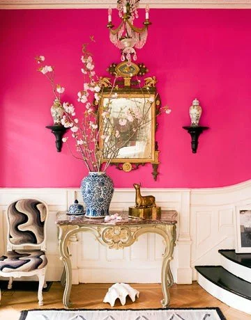
Photo credit and interior design by Jonathan Berger
The entry is the place to set the tone for the whole house. I love the bold choice of hot pink with the contrast of black and white.
Clementine E14


Photo credit by Traditional Home
The stark contrast of the navy walls and white against the white trim sets the tone for this foyer. Classic and dramatic!
Inka Dinka No. 42

I love it in the Fine Paints of Europe Hollandac Brilliant finish. It gives it the luster and shine like no other paint!
Sidebar: Jetta is a terrier of one of my clients. He is a real ham always clamoring for attention and by that I mean barking!
Inka Dinka is my other cat. Obviously black but he has white paws and spots. Sparkling green eyes. His name is Inky but his nickname is Inka Dinka.
Happy Painting......


Hue Are You? With Christopher Kennedy
Hue Are You?
Designer Spotlight: Christopher Kennedy
photo by Molly & Co.
Susan Jamieson: What one color represents your design style?
Christopher Kennedy: Yellow. Happy, brave, and optimistic.
SJ: Do you use color as a dominant role in your designs or as an accent?
CK: I am a Gemini, do I have to choose? I actually use quite a bit of white (especially on walls) and neutrals, but I do use healthy doses of color as an accent. I think my firm is known for its use of color, but it is nearly always an accent.

SJ: How do you feel about matching colors in a room?
CK: I tend to do entire houses, mostly vacation homes where everything is selected by team and is new for the property and homeowner. Occasionally, I notice that our designs scheme can get a bit matchy-matchy. It is easy to get carried away with too much of a single color story -- after all, it looks great on the design boards. I have to remind myself and the team to throw in a color to make it just a bit "off", a bit collected. We never want that model home feeling, where everything is just so perfectly coordinated.

SJ: What color represents your personality?
CK: That's tough: Maybe green. It doesn't steal the focus of red, yellow, or orange. But it is a lasting color, full of depth. I feel like green gets better the more time you spend with it.

SJ: What color comes to mind when you talk about:
Your favorite City ....... Barcelona: I think of blue. The water; the inky blue sky at night as I walk the streets and enjoy the cafes. I also think of the fresh chalky marble white of the new construction in the Sagrada Familiar. It's incredible to see the progress in just the last decade.
The House You Grew Up In ......... Peach and Blue: the country style popular in the 80s and early 90s.
Last Fabulous Dinner You Had ........ Burgundy: as in fabulous red wine.
Your favorite Flower ....... Green, all colors: I am a succulent guy.
Your favorite season ...... Pink: Spring and summer. Pink flowers and the pink pool floats in my pool.
Your Favorite Art ...... Most of my favorite artists use every color: Stella, Hirst, Picasso.

Your Favorite Room in Your Home ..... I don't play favorites
Your Favorite Article of Clothing ...... White: I love a crisp, white, freshly laundered dress shirt.
SJ: Name a color you never use?
CK: I don't use a lot of red. I do most of work in Palm Springs, where it is already quite hot. I use mostly cool colors.
SJ: Name a color you use frequently?
CK: Blue and green are my go-to colors. Blue, especially aqua to turquoise, to represent the water and sky. Green for the grass, succulents, and palm trees.

SJ: Do you have a pet? What color reminds you of him/her? Do you have a nickname for this pet?
CK: Yes, I have my Harley. He is a rescue. He looks like a golden retriever that was shrunk in the dryer. He is the most beautiful orange color. I call him Harley-Barley.

SJ: What is the Now Neutral?
CK: I am so tired of grey, though it is the now neutral. But I am into blue as the new neutral, especially deep inky navy blue.
SJ: What is your prediction for the next big color trend?
CK: I am trying to bring back warm neutrals. Everything from off-white to oatmeal to sand to -- dare I say it -- beige.
SJ: What are the best color combinations?
CK: I think people have forgotten that you can mix warm and cool neutrals in the same house. Not everything has to be grey and white, people! I love grey and brown together. Think of men's fashion -- like wearing a grey suit with a great pair or brown or camel shoes. Let's start mixing neutrals again, people!

SJ: Best advice when it comes to picking paint colors?
CK: I just spent the morning looking at exterior paint colors in 110 degree heat, and nearly had a meltdown in every regard -- so, today, maybe I am not the guy to ask. My only advice is -- test, test, test. My client could not believe that the beautiful taupe-sandy color we had picked out together in my studio was the one we were looking at tested on her house. It went almost bright algae green in the Palm Springs morning sun.
Thank you Christopher for your insight on color!
Check out Christopher's books:

or Follow him on Instagram @christopherkennedyinc
Bridget Beari Color Rule #4 - View Spaces As Volumes

#4
View Spaces as Volumes
Trim does not need to be painted white to stand out. Here a taupe purple color against these gold walls draws your eye right to the architectural trim and doors. By painting the ceiling and walls the same color, the ceiling becomes higher and the space becomes viewed as a volume.

Photo credit: Traditional Home
Similar Bridget Beari Colors are Mr. B No. 17 and Bingle No. 71


Sidebar: Bellagio Blue is named after a horse of one of my employees.
Mr. B is named after my dog Baron. Since he is the biggest boy and my only boy, we call him Big Boy or Mr. B. He is half Sharpei and half pit bull. We took him from a guy who had brought this tiny puppy down to Virginia from NYC for his girlfriend. She did not want him. He saw us walking my dog Beari the Sharpei and asked if we would take him. Of Course!!! He did tell us he was a Sharpei but as he grew we began to see the pit. We named him after the guy Baron Hunter.
Bingle is my cat. She is grey, peach and white. Her real name is Bing but her nickname is Bingle among others. She was another stray that came into our lives.
Tip: The Golden Ratio is 1 to 1.62
Bridget Beari Color Rule #3 - Use Color To Highlight Architectural Features
#3
Use Color to Highlight Architectural Features
Below is a room by Bunny Williams, notice how the columns, crown, and wainscoting is highlighted by painting the surround flat area in a turquoise and the trim in a gloss white. This contrast makes you notice the woodwork.

Photo Credit: House Beautiful
For a similar color in the Bridget Beari Line, try Petula E34 with Snowball trim No. 2


For information on ordering the paint, see our website: Bridget Beari Colors
I love this quote from Kelly Wearstler: "Living Without Color is like living without love! "
Bridget Beari Color Rule #2 - Temper Hot Colors with Cool Colors
#2
Temper Hot Colors with Cool Colors
This is a place where most people have trouble. They are looking for the biggest, grandest statement. The bigger, the bolder, the shinier, the better. It is so important to have balance within a room so theses strong statements don't take over. Don't get me wrong I love a bold statement but you have to know how to make it work!

photo from Martha Stewart Living
The balance is created by using a strong color like Dukey Pukey No. 20 behind the bookcase and painting a larger area - the bookcase in a cool color like Water Bowl No. 47. It is also key that the strong is used in the upholstery and walls are a neutral color. This allows the bookcase to act as a focal point but the colors are still balanced within the room.


To Find these colors, visit the website: Bridget Beari Colors
Sidebar: Dukey Pukey is a cat. She is tortoise color but her name is Daisy. Her nickname is Daisy Duke. Sometimes it changes to Dukey and then Dukey Pukey ( not puke like throw up ) but pukey like cutie!
Paint Tip:
1 gallon of paint will cover approximately 400 sq. ft. of wall