3 Paint Color Questions That Matter
Ask yourself these three questions when picking out paint colors for your next decor project.

Aqua dining room walls make a bold statement and highlight the client’s artwork.
Choosing a paint color doesn’t have to feel overwhelming. Many people struggle with how to choose paint colors because they’re given too much technical advice and not enough structure. Undertones, trends, lighting, and opinions all compete for attention. This leaves you unsure where to start. In reality, you only need a few clear questions to make confident color decisions. In this article, you will learn what those questions are and how best to answer them for yourself.
The Color questions:
These three questions form the foundation of Bridget Beari Color Rules, and they work whether you’re painting one room or an entire home.
Question #1: How Do I Want to Feel in This Room?
Paint color affects mood before it affects aesthetics.
Before looking at swatches, decide how you want the space to feel:
calm
grounded
light
cozy
focused
energized
Designing with feeling in mind helps narrow paint color choices quickly and reduces decision fatigue. If a color doesn’t support the emotional experience you want, it’s not the right choice no matter how popular it is.
Question #2: What Is the Light Actually Doing?
Light dramatically changes how paint color looks. Natural light, artificial light, time of day, and room orientation all affect color perception. This is why a paint color that looks perfect online can feel wrong at home.
Instead of asking, “Is this a good paint color?” ask:
“How does this color behave in this light?”
Always test paint in the room where it will live and observe it over time.
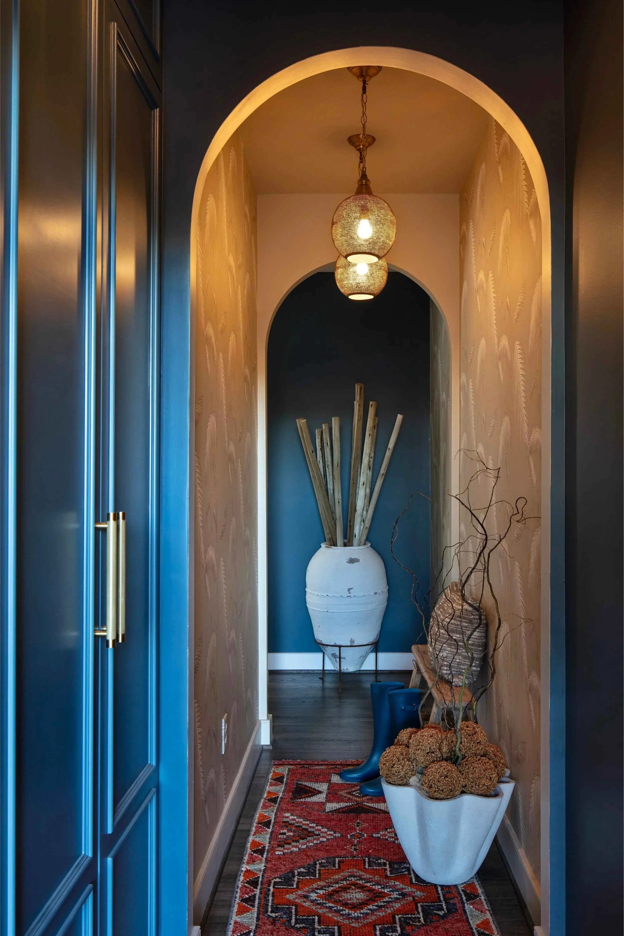
This rich, deep blue wall color is enhanced by the direct light that comes through the front door, accenting the decor as you walk through the hallway.
Question #3: What Needs to Stay Consistent?
Most paint color mistakes happen when rooms are treated as isolated decisions. A home feels cohesive when undertones, tone, or mood remain consistent from room to room. Consistency doesn’t mean everything matches. It means colors relate.
Before choosing a color, consider:
what colors it will sit next to
what tones should repeat
what should stay quiet and supportive
Consistency is one of the fastest ways to create a calm, intentional home.
why this paint color system works:
You don’t need an instinct for color to choose well. These questions don’t rely solely on intuition. They rely on observation and structure. This makes them especially helpful if you don’t yet trust your eye. This approach is central to Bridget Beari Color Rules: a calm, repeatable system for choosing color without overwhelm or trends.

Swatching different shades of peachy pink shows the differences in subtle undertones.
Quick Paint Color Checklist:
Use this checklist before choosing any paint color:
Before You Decide, Ask:
☐ How do I want to feel in this room?
☐ What does the light do here throughout the day?
☐ What colors or undertones need to stay consistent nearby?
If the color supports all three, you’re on the right track.
Bridget Beari Color Rules expands this framework across an entire home, helping you apply these questions with confidence, even if choosing color has felt stressful in the past. You don’t need perfect taste. You need a process you can return to. And now, you have one.